Flex 布局
Flexbox 是 CSS 的一维弹性布局模型,通过容器与项目的双轴协作,让空间分配与对齐从"手动计算"变为"声明式驱动"。
核心概念
Flex 容器与项目
Flex 布局的核心模型是 容器-项目 二层结构。当一个元素的 display 设为 flex 或 inline-flex 时,它成为 Flex 容器,其所有直接子元素自动成为 Flex 项目。
/* 块级 Flex 容器:独占一行 */
.container {
  display: flex;
}

/* 行内 Flex 容器:宽度由内容撑开,可与其他行内元素并排 */
.inline-container {
  display: inline-flex;
}
理解容器与项目的关系需要牢记以下规则:
| 规则 | 说明 |
|---|---|
| 仅限直接子元素 | 只有容器的直接子元素才是 Flex 项目,孙级元素不受影响 |
| 匿名 Flex 项目 | 容器内的裸文本节点会被自动包装为匿名 Flex 项目 |
| 绝对定位例外 | 设置了 position: absolute 或 fixed 的子元素脱离 Flex 布局,不参与伸缩与对齐 |
| 嵌套容器 | Flex 项目本身也可以是 Flex 容器,形成嵌套布局 |
| float 失效 | Flex 项目上的 float 和 clear 无效 |
| vertical-align 失效 | Flex 项目上的 vertical-align 无效 |
| 外边距不折叠 | Flex 项目之间的垂直外边距不会折叠(不同于普通流中的块级元素) |
主轴与交叉轴
Flex 布局基于 双轴模型 运作:主轴(Main Axis)决定项目的排列方向,交叉轴(Cross Axis)与主轴垂直,决定项目的对齐方式。所有对齐属性都围绕这两条轴定义,理解轴向是掌握 Flex 布局的前提。
轴向术语:
| 术语 | 含义 | 相关属性 |
|---|---|---|
| main start / main end | 主轴起点 / 终点 | justify-content、flex-grow |
| cross start / cross end | 交叉轴起点 / 终点 | align-items、align-content |
| main size | 主轴方向尺寸 | flex-basis、width(row 时) |
| cross size | 交叉轴方向尺寸 | height(row 时) |
主轴方向由 flex-direction 决定,交叉轴始终与主轴垂直。不同 flex-direction 值下两轴的方向关系如下:
关键认知:justify-content 永远作用于主轴,align-items 永远作用于交叉轴——它们不关心轴是水平还是垂直。当 flex-direction: column 时,justify-content 控制的是垂直方向对齐,align-items 控制的是水平方向对齐。
容器属性详解
Flex 容器属性控制项目的排列方向、换行行为、对齐方式和间距。以下属性均设置在 Flex 容器上。
flex-direction
flex-direction 决定主轴方向,即项目的排列方向。它是 Flex 布局中最基础的属性,直接影响所有对齐属性的作用方向。
| 值 | 主轴方向 | 交叉轴方向 | 说明 |
|---|---|---|---|
row | 水平 → | 垂直 ↓ | 默认值,从左到右 |
row-reverse | 水平 ← | 垂直 ↓ | 从右到左 |
column | 垂直 ↓ | 水平 → | 从上到下 |
column-reverse | 垂直 ↑ | 水平 → | 从下到上 |
<div class="container row">A B C</div>
<div class="container col">A B C</div>.container {
display: flex;
gap: 10px;
padding: 10px;
border: 2px solid #1976d2;
margin-bottom: 10px;
}
/* 水平排列(默认) */
.row {
flex-direction: row;
}
/* 垂直排列 */
.col {
flex-direction: column;
}注意:
row-reverse和column-reverse仅改变视觉排列方向,不改变 DOM 顺序。屏幕阅读器等辅助技术仍按 DOM 顺序读取内容。
flex-wrap
flex-wrap 控制项目是否换行。默认情况下,Flex 项目会尽量挤在一行中,即使被压缩到小于内容宽度。
| 值 | 行为 |
|---|---|
nowrap | 默认值,不换行,项目被压缩以适应单行 |
wrap | 换行,第一行在上方 |
wrap-reverse | 换行,第一行在下方 |
<div class="container">
  <div class="item">1</div>
  <div class="item">2</div>
  <div class="item">3</div>
  <div class="item">4</div>
  <div class="item">5</div>
</div>.container {
display: flex;
flex-wrap: wrap; /* 允许换行 */
gap: 10px;
}
.item {
/* 每个项目最小 200px,空间不足时自动换行 */
flex: 1 1 200px;
min-width: 0;
height: 80px;
background: #e3f2fd;
border: 1px solid #1976d2;
}要点:
nowrap下项目会被压缩(受flex-shrink控制);wrap下项目不会被压缩,空间不足时自动折到下一行。需要响应式布局时,flex-wrap: wrap配合flex-basis是常用模式。
flex-wrap 交互演示(MDN)
设置 flex 项目是否换行(nowrap/wrap/wrap-reverse)。
<!DOCTYPE html>
<html lang="zh-CN">
  <head>
    <meta charset="UTF-8" />
    <meta name="viewport" content="width=device-width, initial-scale=1.0" />
    <title>flex-wrap 属性演示 - MDN 示例</title>
    <meta name="description" content="演示flex(wrap 属性演示)效果。" />
    <style>
      * {
        margin: 0;
        padding: 0;
        box-sizing: border-box;
      }
      body {
        font-family: -apple-system, BlinkMacSystemFont, "Segoe UI", Roboto, "Helvetica Neue", Arial, sans-serif;
        min-height: 100vh;
        padding: 0;
      }
      .demo-layout {
        display: flex;
        height: 100vh;
        gap: 0;
      }
      .snippet-panel {
        width: 320px;
        flex-shrink: 0;
        padding: 16px;
        display: flex;
        flex-direction: column;
        gap: 8px;
        overflow-y: auto;
        border-right: 1px solid #ddd;
        background: #fafafa;
      }
      .snippet-btn {
        padding: 10px 14px;
        border: 1px solid #ccc;
        border-radius: 6px;
        background: #fff;
        font-family: "JetBrains Mono", "Fira Code", monospace;
        font-size: 13px;
        color: #333;
        cursor: pointer;
        text-align: left;
        transition: all 0.2s;
        line-height: 1.4;
      }
      .snippet-btn:hover {
        border-color: #8083ff;
        background: #f0f0ff;
      }
      .snippet-btn.active {
        border-color: #8083ff;
        background: #e8e8ff;
        color: #571bc1;
        font-weight: 600;
      }
      .preview-panel {
        flex: 1;
        padding: 16px;
        display: flex;
        align-items: center;
        justify-content: center;
        background: #fff;
        overflow: auto;
      }
      .preview-panel > section,
      .preview-panel > div:not(.snippet-panel):not(.demo-layout) {
        flex: 1;
        width: 100%;
        min-height: 0;
        height: 100%;
        display: flex;
        align-items: center;
        justify-content: center;
      }
      #example-element {
        border: 1px solid #c5c5c5;
        width: 80%;
        display: flex;
      }

      #example-element > div {
        background-color: rgba(0, 0, 255, 0.2);
        border: 3px solid blue;
        width: 60px;
        margin: 10px;
      }
    </style>
  </head>
  <body>
    <div class="demo-layout">
      <div class="snippet-panel">
        <button class="snippet-btn active" data-index="0">flex-wrap: nowrap;</button>
        <button class="snippet-btn" data-index="1">flex-wrap: wrap;</button>
        <button class="snippet-btn" data-index="2">flex-wrap: wrap-reverse;</button>
      </div>
      <div class="preview-panel">
        <section class="default-example" id="default-example">
          <div class="transition-all" id="example-element">
            <div>Item One</div>
            <div>Item Two</div>
            <div>Item Three</div>
            <div>Item Four</div>
            <div>Item Five</div>
            <div>Item Six</div>
          </div>
        </section>
      </div>
    </div>
    <script>
      const snippets = [
        `#example-element {
  flex-wrap: nowrap;
}`,
        `#example-element {
  flex-wrap: wrap;
}`,
        `#example-element {
  flex-wrap: wrap-reverse;
}`,
      ];

      let styleEl = document.createElement("style");
      document.head.appendChild(styleEl);

      function applySnippet(index) {
        styleEl.textContent = snippets[index];
        document.querySelectorAll(".snippet-btn").forEach((btn, i) => {
          btn.classList.toggle("active", i === index);
        });
      }

      document.querySelectorAll(".snippet-btn").forEach((btn) => {
        btn.addEventListener("click", () => applySnippet(parseInt(btn.dataset.index)));
      });

      applySnippet(0);
    </script>
  </body>
</html>
flex-flow
flex-flow 是 flex-direction 和 flex-wrap 的简写属性,默认值为 row nowrap。
.container {
  display: flex;

  /* 完整写法:方向 + 换行 */
  flex-flow: row wrap;

  /* 等同于分开写 */
  /* flex-direction: row; */
  /* flex-wrap: wrap; */
}
flex-flow 的两个值可以互换顺序,浏览器会自动识别。实际开发中,如果方向为默认的 row,通常只写 flex-wrap 即可。
justify-content
justify-content 控制项目在主轴上的对齐方式,决定剩余空间如何分配。这是使用频率最高的 Flex 属性之一。
| 值 | 对齐方式 | 首项目前间距 | 项目间间距 | 尾项目后间距 |
|---|---|---|---|---|
flex-start | 起点对齐 | 0 | 0 | 全部剩余 |
flex-end | 终点对齐 | 全部剩余 | 0 | 0 |
center | 居中对齐 | 剩余/2 | 0 | 剩余/2 |
space-between | 两端对齐 | 0 | 剩余/(n-1) | 0 |
space-around | 等距环绕 | 剩余/2n | 剩余/n | 剩余/2n |
space-evenly | 均匀分布 | 剩余/(n+1) | 剩余/(n+1) | 剩余/(n+1) |
n 为项目数量。当只有一个项目时,
space-between等同于flex-start。
<div class="container">
  <div class="item">A</div>
  <div class="item">B</div>
  <div class="item">C</div>
</div>.container {
display: flex;
justify-content: space-between; /* 两端对齐,项目间间距相等 */
padding: 10px;
border: 2px solid #1976d2;
}
.item {
width: 80px;
height: 40px;
background: #e3f2fd;
border: 1px solid #1976d2;
display: flex;
justify-content: center;
align-items: center;
}注意:
justify-content仅在有剩余空间时生效。如果项目设置了flex-grow占满了主轴,或项目总宽度已超出容器,则对齐效果不可见。
justify-content 交互演示(MDN)
设置 flex/grid 容器主轴方向项目的对齐与分布方式。
<!DOCTYPE html>
<html lang="zh-CN">
  <head>
    <meta charset="UTF-8" />
    <meta name="viewport" content="width=device-width, initial-scale=1.0" />
    <title>justify-content 属性演示 - MDN 示例</title>
    <meta name="description" content="演示justify(content 属性演示)效果。" />
    <style>
      * {
        margin: 0;
        padding: 0;
        box-sizing: border-box;
      }
      body {
        font-family: -apple-system, BlinkMacSystemFont, "Segoe UI", Roboto, "Helvetica Neue", Arial, sans-serif;
        min-height: 100vh;
        padding: 0;
      }
      .demo-layout {
        display: flex;
        height: 100vh;
        gap: 0;
      }
      .snippet-panel {
        width: 320px;
        flex-shrink: 0;
        padding: 16px;
        display: flex;
        flex-direction: column;
        gap: 8px;
        overflow-y: auto;
        border-right: 1px solid #ddd;
        background: #fafafa;
      }
      .snippet-btn {
        padding: 10px 14px;
        border: 1px solid #ccc;
        border-radius: 6px;
        background: #fff;
        font-family: "JetBrains Mono", "Fira Code", monospace;
        font-size: 13px;
        color: #333;
        cursor: pointer;
        text-align: left;
        transition: all 0.2s;
        line-height: 1.4;
      }
      .snippet-btn:hover {
        border-color: #8083ff;
        background: #f0f0ff;
      }
      .snippet-btn.active {
        border-color: #8083ff;
        background: #e8e8ff;
        color: #571bc1;
        font-weight: 600;
      }
      .preview-panel {
        flex: 1;
        padding: 16px;
        display: flex;
        align-items: center;
        justify-content: center;
        background: #fff;
        overflow: auto;
      }
      .preview-panel > section,
      .preview-panel > div:not(.snippet-panel):not(.demo-layout) {
        flex: 1;
        width: 100%;
        min-height: 0;
        height: 100%;
        display: flex;
        align-items: center;
        justify-content: center;
      }
      #example-element {
        border: 1px solid #c5c5c5;
        width: 220px;
        display: grid;
        grid-template-columns: 60px 60px;
        grid-auto-rows: 40px;
        row-gap: 10px;
      }

      #example-element > div {
        background-color: rgba(0, 0, 255, 0.2);
        border: 3px solid blue;
      }
    </style>
  </head>
  <body>
    <div class="demo-layout">
      <div class="snippet-panel">
        <button class="snippet-btn active" data-index="0">justify-content: start;</button>
        <button class="snippet-btn" data-index="1">justify-content: center;</button>
        <button class="snippet-btn" data-index="2">justify-content: space-between;</button>
        <button class="snippet-btn" data-index="3">justify-content: space-around;</button>
        <button class="snippet-btn" data-index="4">justify-content: space-evenly;</button>
      </div>
      <div class="preview-panel">
        <section class="default-example" id="default-example">
          <div class="example-container">
            <div class="transition-all" id="example-element">
              <div>One</div>
              <div>Two</div>
              <div>Three</div>
            </div>
          </div>
        </section>
      </div>
    </div>
    <script>
      const snippets = [
        `#example-element {
  justify-content: start;
}`,
        `#example-element {
  justify-content: center;
}`,
        `#example-element {
  justify-content: space-between;
}`,
        `#example-element {
  justify-content: space-around;
}`,
        `#example-element {
  justify-content: space-evenly;
}`,
      ];

      let styleEl = document.createElement("style");
      document.head.appendChild(styleEl);

      function applySnippet(index) {
        styleEl.textContent = snippets[index];
        document.querySelectorAll(".snippet-btn").forEach((btn, i) => {
          btn.classList.toggle("active", i === index);
        });
      }

      document.querySelectorAll(".snippet-btn").forEach((btn) => {
        btn.addEventListener("click", () => applySnippet(parseInt(btn.dataset.index)));
      });

      applySnippet(0);
    </script>
  </body>
</html>
align-items
align-items 控制项目在交叉轴上的对齐方式。当 flex-direction: row 时,它控制垂直对齐;当 flex-direction: column 时,它控制水平对齐。
| 值 | 行为 |
|---|---|
stretch | 默认值,拉伸填满容器交叉轴方向(需项目未设置交叉轴尺寸) |
flex-start | 交叉轴起点对齐 |
flex-end | 交叉轴终点对齐 |
center | 交叉轴居中对齐 |
baseline | 项目的文本基线对齐 |
<div class="container">
  <div class="item tall">A</div>
  <div class="item">B</div>
  <div class="item small">C</div>
</div>.container {
display: flex;
align-items: center; /* 交叉轴居中 */
height: 200px;
border: 2px solid #1976d2;
}
.item {
width: 80px;
background: #e3f2fd;
border: 1px solid #1976d2;
display: flex;
justify-content: center;
align-items: center;
}
.tall { height: 120px; }
.small { height: 40px; }
stretch的陷阱:如果项目显式设置了交叉轴方向的尺寸(如height),stretch不会拉伸它。只有未设置尺寸时才会生效。这是初学者常遇到的"为什么 stretch 不生效"的原因。
align-items 交互演示(MDN)
设置 flex/grid 容器交叉轴方向项目的对齐方式。
<!DOCTYPE html>
<html lang="zh-CN">
  <head>
    <meta charset="UTF-8" />
    <meta name="viewport" content="width=device-width, initial-scale=1.0" />
    <title>align-items 属性演示 - MDN 示例</title>
    <meta name="description" content="演示align(items 属性演示)效果。" />
    <style>
      * {
        margin: 0;
        padding: 0;
        box-sizing: border-box;
      }
      body {
        font-family: -apple-system, BlinkMacSystemFont, "Segoe UI", Roboto, "Helvetica Neue", Arial, sans-serif;
        min-height: 100vh;
        padding: 0;
      }
      .demo-layout {
        display: flex;
        height: 100vh;
        gap: 0;
      }
      .snippet-panel {
        width: 320px;
        flex-shrink: 0;
        padding: 16px;
        display: flex;
        flex-direction: column;
        gap: 8px;
        overflow-y: auto;
        border-right: 1px solid #ddd;
        background: #fafafa;
      }
      .snippet-btn {
        padding: 10px 14px;
        border: 1px solid #ccc;
        border-radius: 6px;
        background: #fff;
        font-family: "JetBrains Mono", "Fira Code", monospace;
        font-size: 13px;
        color: #333;
        cursor: pointer;
        text-align: left;
        transition: all 0.2s;
        line-height: 1.4;
      }
      .snippet-btn:hover {
        border-color: #8083ff;
        background: #f0f0ff;
      }
      .snippet-btn.active {
        border-color: #8083ff;
        background: #e8e8ff;
        color: #571bc1;
        font-weight: 600;
      }
      .preview-panel {
        flex: 1;
        padding: 16px;
        display: flex;
        align-items: center;
        justify-content: center;
        background: #fff;
        overflow: auto;
      }
      .preview-panel > section,
      .preview-panel > div:not(.snippet-panel):not(.demo-layout) {
        flex: 1;
        width: 100%;
        min-height: 0;
        height: 100%;
        display: flex;
        align-items: center;
        justify-content: center;
      }
      #example-element {
        border: 1px solid #c5c5c5;
        display: grid;
        width: 200px;
        grid-template-columns: 1fr 1fr;
        grid-auto-rows: 80px;
        grid-gap: 10px;
      }

      #example-element > div {
        background-color: rgba(0, 0, 255, 0.2);
        border: 3px solid blue;
      }
    </style>
  </head>
  <body>
    <div class="demo-layout">
      <div class="snippet-panel">
        <button class="snippet-btn active" data-index="0">align-items: stretch;</button>
        <button class="snippet-btn" data-index="1">align-items: center;</button>
        <button class="snippet-btn" data-index="2">align-items: start;</button>
        <button class="snippet-btn" data-index="3">align-items: end;</button>
      </div>
      <div class="preview-panel">
        <section class="default-example" id="default-example">
          <div class="example-container">
            <div class="transition-all" id="example-element">
              <div>One</div>
              <div>Two</div>
              <div>Three</div>
            </div>
          </div>
        </section>
      </div>
    </div>
    <script>
      const snippets = [
        `#example-element {
  align-items: stretch;
}`,
        `#example-element {
  align-items: center;
}`,
        `#example-element {
  align-items: start;
}`,
        `#example-element {
  align-items: end;
}`,
      ];

      let styleEl = document.createElement("style");
      document.head.appendChild(styleEl);

      function applySnippet(index) {
        styleEl.textContent = snippets[index];
        document.querySelectorAll(".snippet-btn").forEach((btn, i) => {
          btn.classList.toggle("active", i === index);
        });
      }

      document.querySelectorAll(".snippet-btn").forEach((btn) => {
        btn.addEventListener("click", () => applySnippet(parseInt(btn.dataset.index)));
      });

      applySnippet(0);
    </script>
  </body>
</html>
align-content
align-content 控制多行项目在交叉轴方向的整体对齐方式。仅在 flex-wrap: wrap 且有多行时生效,单行情况下无效。
| 值 | 行为 |
|---|---|
stretch | 默认值,各行拉伸填满交叉轴剩余空间 |
flex-start | 所有行紧贴交叉轴起点 |
flex-end | 所有行紧贴交叉轴终点 |
center | 所有行在交叉轴居中 |
space-between | 行间间距相等,首尾行紧贴容器边缘 |
space-around | 每行两侧间距相等 |
<div class="container">
  <div class="item">1</div>
  <div class="item">2</div>
  <div class="item">3</div>
  <div class="item">4</div>
  <div class="item">5</div>
  <div class="item">6</div>
</div>.container {
display: flex;
flex-wrap: wrap; /* 必须允许换行 */
align-content: space-between; /* 多行在交叉轴两端对齐 */
height: 300px; /* 容器必须有足够高度 */
gap: 10px;
border: 2px solid #1976d2;
}
.item {
width: 120px;
height: 60px;
background: #e3f2fd;
border: 1px solid #1976d2;
}
align-content与align-items的区别:align-items控制单行内项目在交叉轴上的对齐;align-content控制多行作为整体在交叉轴上的分布。两者可以同时使用,align-content先决定行的位置,align-items再决定行内项目的对齐。
align-content 交互演示(MDN)
设置多行 flex/grid 项目在交叉轴上的分布方式。
<!DOCTYPE html>
<html lang="zh-CN">
  <head>
    <meta charset="UTF-8" />
    <meta name="viewport" content="width=device-width, initial-scale=1.0" />
    <title>align-content 属性演示 - MDN 示例</title>
    <meta name="description" content="演示align(content 属性演示)效果。" />
    <style>
      * {
        margin: 0;
        padding: 0;
        box-sizing: border-box;
      }
      body {
        font-family: -apple-system, BlinkMacSystemFont, "Segoe UI", Roboto, "Helvetica Neue", Arial, sans-serif;
        min-height: 100vh;
        padding: 0;
      }
      .demo-layout {
        display: flex;
        height: 100vh;
        gap: 0;
      }
      .snippet-panel {
        width: 320px;
        flex-shrink: 0;
        padding: 16px;
        display: flex;
        flex-direction: column;
        gap: 8px;
        overflow-y: auto;
        border-right: 1px solid #ddd;
        background: #fafafa;
      }
      .snippet-btn {
        padding: 10px 14px;
        border: 1px solid #ccc;
        border-radius: 6px;
        background: #fff;
        font-family: "JetBrains Mono", "Fira Code", monospace;
        font-size: 13px;
        color: #333;
        cursor: pointer;
        text-align: left;
        transition: all 0.2s;
        line-height: 1.4;
      }
      .snippet-btn:hover {
        border-color: #8083ff;
        background: #f0f0ff;
      }
      .snippet-btn.active {
        border-color: #8083ff;
        background: #e8e8ff;
        color: #571bc1;
        font-weight: 600;
      }
      .preview-panel {
        flex: 1;
        padding: 16px;
        display: flex;
        align-items: center;
        justify-content: center;
        background: #fff;
        overflow: auto;
      }
      .preview-panel > section,
      .preview-panel > div:not(.snippet-panel):not(.demo-layout) {
        flex: 1;
        width: 100%;
        min-height: 0;
        height: 100%;
        display: flex;
        align-items: center;
        justify-content: center;
      }
      #example-element {
        border: 1px solid #c5c5c5;
        display: grid;
        grid-template-columns: 60px 60px;
        grid-auto-rows: 40px;
        column-gap: 10px;
        height: 180px;
      }

      #example-element > div {
        background-color: rgba(0, 0, 255, 0.2);
        border: 3px solid blue;
      }
    </style>
  </head>
  <body>
    <div class="demo-layout">
      <div class="snippet-panel">
        <button class="snippet-btn active" data-index="0">align-content: start;</button>
        <button class="snippet-btn" data-index="1">align-content: center;</button>
        <button class="snippet-btn" data-index="2">align-content: space-between;</button>
        <button class="snippet-btn" data-index="3">align-content: space-around;</button>
      </div>
      <div class="preview-panel">
        <section class="default-example" id="default-example">
          <div class="example-container">
            <div class="transition-all" id="example-element">
              <div>One</div>
              <div>Two</div>
              <div>Three</div>
            </div>
          </div>
        </section>
      </div>
    </div>
    <script>
      const snippets = [
        `#example-element {
  align-content: start;
}`,
        `#example-element {
  align-content: center;
}`,
        `#example-element {
  align-content: space-between;
}`,
        `#example-element {
  align-content: space-around;
}`,
      ];

      let styleEl = document.createElement("style");
      document.head.appendChild(styleEl);

      function applySnippet(index) {
        styleEl.textContent = snippets[index];
        document.querySelectorAll(".snippet-btn").forEach((btn, i) => {
          btn.classList.toggle("active", i === index);
        });
      }

      document.querySelectorAll(".snippet-btn").forEach((btn) => {
        btn.addEventListener("click", () => applySnippet(parseInt(btn.dataset.index)));
      });

      applySnippet(0);
    </script>
  </body>
</html>
gap
gap 属性控制 Flex 项目之间的间距,是替代传统 margin 方案的现代方式。它只作用于项目之间,不会在容器边缘产生间距。
| 属性 | 说明 |
|---|---|
gap | 行间距和列间距的简写 |
row-gap | 仅控制行间距(多行时生效) |
column-gap | 仅控制列间距 |
.container {
  display: flex;
  flex-wrap: wrap;

  /* 单值:行间距 = 列间距 */
  gap: 20px;

  /* 双值:行间距 列间距 */
  gap: 20px 30px;

  /* 也可以分别设置 */
  row-gap: 20px;
  column-gap: 30px;
}<div class="container">
<div class="item">A</div>
<div class="item">B</div>
<div class="item">C</div>
<div class="item">D</div>
</div>.container {
display: flex;
flex-wrap: wrap;
gap: 16px; /* 项目间距 16px,不会在容器边缘产生间距 */
padding: 16px;
border: 2px solid #1976d2;
}
.item {
flex: 1 1 150px;
height: 80px;
background: #e3f2fd;
border: 1px solid #1976d2;
}
gap与margin的核心区别:gap只在项目之间生效,首尾项目不会产生多余间距;margin需要手动处理首尾元素的间距问题(如:last-child { margin-right: 0 })。优先使用gap。
gap 交互演示(MDN)
设置 flex/grid 容器中项目之间的间距,可分别指定行距与列距。
<!DOCTYPE html>
<html lang="zh-CN">
<head>
<meta charset="UTF-8" />
<meta name="viewport" content="width=device-width, initial-scale=1.0" />
<title>gap 属性演示 - MDN 示例</title>
<meta name="description" content="演示gap 属性演示效果。" />
<style>
* {
margin: 0;
padding: 0;
box-sizing: border-box;
}
body {
font-family: -apple-system, BlinkMacSystemFont, 'Segoe UI', Roboto, 'Helvetica Neue', Arial, sans-serif;
min-height: 100vh;
padding: 0;
}
.demo-layout {
display: flex;
height: 100vh;
gap: 0;
}
.snippet-panel {
width: 320px;
flex-shrink: 0;
padding: 16px;
display: flex;
flex-direction: column;
gap: 8px;
overflow-y: auto;
border-right: 1px solid #ddd;
background: #fafafa;
}
.snippet-btn {
padding: 10px 14px;
border: 1px solid #ccc;
border-radius: 6px;
background: #fff;
font-family: 'JetBrains Mono', 'Fira Code', monospace;
font-size: 13px;
color: #333;
cursor: pointer;
text-align: left;
transition: all 0.2s;
line-height: 1.4;
}
.snippet-btn:hover {
border-color: #8083ff;
background: #f0f0ff;
}
.snippet-btn.active {
border-color: #8083ff;
background: #e8e8ff;
color: #571bc1;
font-weight: 600;
}
.preview-panel {
flex: 1;
padding: 16px;
display: flex;
align-items: center;
justify-content: center;
background: #fff;
overflow: auto;
}
.preview-panel > section,
.preview-panel > div:not(.snippet-panel):not(.demo-layout) {
flex: 1;
width: 100%;
min-height: 0;
height: 100%;
display: flex;
align-items: center;
justify-content: center;
}
:root {
--link-color: 0;
--secondary-button-fill-color: 0;
--secondary-button-border-color: 0;
--secondary-button-text-color: 0;
--primary-button-text-color: 0;
--primary-button-fill-color: 0;
--primary-button-fill-color-active: 0;
--secondary-button-hover-fill-color: 0;
--secondary-button-hover-border-color: 0;
--error-code-color: 0;
--heading-color: 0;
--google-red-10: 0;
--small-link-color: 0;
--background-color: 0;
--google-blue-600: 0;
--google-gray-300: 0;
--google-gray-700: 0;
--text-color: 0;
--google-blue-300: 0;
--google-gray-50: 0;
--google-gray-800: 0;
--google-gray-100: 0;
}
/* Copyright 2017 The Chromium Authors
* Use of this source code is governed by a BSD-style license that can be
* found in the LICENSE file. */
a {
color: var(--link-color);
text-decoration: none
}
.nav-wrapper .secondary-button {
background: var(--secondary-button-fill-color);
border: 1px solid var(--secondary-button-border-color);
color: var(--secondary-button-text-color);
float: none;
margin: 0;
padding: 8px 16px
}
.hidden {
display: none
}
.icon {
background-repeat: no-repeat;
background-size: 100%;
height: 72px;
margin: 0 0 40px;
width: 72px;
-webkit-user-select: none;
display: inline-block
}
@media (prefers-color-scheme: dark) {
}
button {
border: 0;
border-radius: 20px;
box-sizing: border-box;
color: var(--primary-button-text-color);
cursor: pointer;
float: right;
font-size: .875em;
margin: 0;
padding: 8px 16px;
transition: box-shadow 150ms cubic-bezier(0.4, 0, 0.2, 1);
user-select: none
}
[dir='rtl'] button {
float: left
}
.bad-clock button, .captive-portal button, .https-only button, .insecure-form button, .lookalike-url button, .main-frame-blocked button, .neterror button, .pdf button, .ssl button, .enterprise-block button, .enterprise-warn button, .managed-profile-required button, .safe-browsing-billing button, .supervised-user-verify button, .supervised-user-verify-subframe button {
background: var(--primary-button-fill-color)
}
button:active {
background: var(--primary-button-fill-color-active);
outline: 0
}
#debugging {
display: inline;
overflow: auto
}
.debugging-content {
line-height: 1em;
margin-bottom: 0;
margin-top: 1em
}
.debugging-content-fixed-width {
display: block;
font-family: monospace;
font-size: 1.2em;
margin-top: 0.5em
}
.debugging-title {
font-weight: bold
}
#details {
margin: 0 0 50px
}
#details {
p:not(:first-of-type) {
margin-top: 20px
}
}
.secondary-button:active {
border-color: white;
box-shadow: 0 1px 2px 0 rgba(60, 64, 67, .3), 0 2px 6px 2px rgba(60, 64, 67, .15)
}
.secondary-button:hover {
background: var(--secondary-button-hover-fill-color);
border-color: var(--secondary-button-hover-border-color);
text-decoration: none
}
.error-code {
color: var(--error-code-color);
font-size: .8em;
margin-top: 12px;
text-transform: uppercase
}
#error-debugging-info {
font-size: 0.8em
}
h1 {
color: var(--heading-color);
font-size: 1.6em;
font-weight: normal;
line-height: 1.25em;
margin-bottom: 16px;
margin-top: 0;
word-wrap: break-word
}
h2 {
font-size: 1.2em;
font-weight: normal
}
input[type=checkbox] {
opacity: 0
}
input[type=checkbox]:focus ~ .checkbox::after {
outline: -webkit-focus-ring-color auto 5px
}
.interstitial-wrapper {
box-sizing: border-box;
font-size: 1em;
line-height: 1.6em;
margin: 14vh auto 0;
max-width: 600px;
width: 100%
}
#main-message > p {
display: inline
}
#extended-reporting-opt-in {
font-size: .875em;
margin-top: 32px
}
#extended-reporting-opt-in label {
display: grid;
grid-template-columns: 1.8em 1fr;
position: relative
}
#enhanced-protection-message {
border-radius: 20px;
font-size: 1em;
margin-top: 32px;
padding: 10px 5px
}
#enhanced-protection-message a {
color: var(--google-red-10)
}
#enhanced-protection-message label {
display: grid;
grid-template-columns: 2.5em 1fr;
position: relative
}
#enhanced-protection-message div {
margin: 0.5em
}
#enhanced-protection-message .icon {
height: 1.5em;
vertical-align: middle;
width: 1.5em
}
.nav-wrapper {
margin-top: 51px
}
.nav-wrapper::after {
clear: both;
content: '';
display: table;
width: 100%
}
.small-link {
color: var(--small-link-color);
font-size: .875em
}
.checkboxes {
flex: 0 0 24px
}
.checkbox {
--padding: .9em;
background: transparent;
display: block;
height: 1em;
left: -1em;
padding-inline-start: var(--padding);
position: absolute;
right: 0;
top: -.5em;
width: 1em
}
.checkbox::after {
border: 1px solid white;
border-radius: 2px;
content: '';
height: 1em;
left: var(--padding);
position: absolute;
top: var(--padding);
width: 1em
}
.checkbox::before {
background: transparent;
border: 2px solid white;
border-inline-end-width: 0;
border-top-width: 0;
content: '';
height: .2em;
left: calc(.3em + var(--padding));
opacity: 0;
position: absolute;
top: calc(.3em + var(--padding));
transform: rotate(-45deg);
width: .5em
}
input[type=checkbox]:checked ~ .checkbox::before {
opacity: 1
}
@media (max-width: 700px) {
.interstitial-wrapper {
.interstitial-wrapper {
padding: 0 10%
}
#error-debugging-info {
overflow: auto
}
}
@media (max-width: 420px) {
button, [dir='rtl'] {
button, [dir='rtl'] button, .small-link float: none;
font-size: .825em;
font-weight: 500;
margin: 0;
width: 100%;
button {
padding: 16px 24px
}
#details {
margin: 20px 0 20px 0
}
#details {
p: not(:first-of-type) margin-top: 10px
}
.secondary-button: not(.hidden) {
display: block
}
margin-top: 20px;
text-align: center;
width: 100%;
.interstitial-wrapper {
padding: 0 5%
}
#extended-reporting-opt-in {
margin-top: 24px
}
#enhanced-protection-message {
margin-top: 24px
}
.nav-wrapper {
margin-top: 30px
}
}
/**
* Mobile specific styling.
* Navigation buttons are anchored to the bottom of the screen.
* Details message replaces the top content in its own scrollable area.
*/
@media (max-width: 420px) {
.nav- {
.nav-wrapper .secondary-button {
border: 0
}
margin: 16px 0 0;
margin-inline-end: 0;
padding-bottom: 16px;
padding-top: 16px
}
@media (min-width: 240px) and (max-width: 420px) and (min-height: 401px), (min-width: 421px) and (min-height: 240px) and (max-height: 560px) {
body .nav-wra {
body .nav-wrapper background: var(--background-color);
bottom: 0;
box-shadow: 0 -12px 24px var(--background-color);
left: 0;
margin: 0 auto;
max-width: 736px;
padding-inline-end: 24px;
padding-inline-start: 24px;
position: fixed;
right: 0;
width: 100%;
z-index: 2;
.interstitial-wrapper {
max-width: 736px
}
#details, #main-content padding-bottom: 40px;
#details {
padding-top: 5.5vh
}
button.small-link color: var(--google-blue-600)
}
@media (max-width: 420px) and (orientation: portrait), (max-height: 560px) {
button, [dir='rtl'] but {
button, [dir='rtl'] button, button.small-link, .nav-wrapper .secondary-button font-family: Roboto-Regular,Helvetica;
font-size: .933em;
margin: 6px 0;
transform: translatez(0);
.nav-wrapper {
box-sizing: border-box
}
padding-bottom: 8px;
width: 100%;
#details {
box-sizing: border-box
}
height: auto;
margin: 0;
opacity: 1;
transition: opacity 250ms cubic-bezier(0.4, 0, 0.2, 1);
#details.hidden, #main-content.hidden height: 0;
opacity: 0;
overflow: hidden;
padding-bottom: 0;
transition: none;
h1 {
font-size: 1.5em
}
margin-bottom: 8px;
.icon {
margin-bottom: 5.69vh
}
.interstitial-wrapper {
box-sizing: border-box
}
margin: 7vh auto 12px;
padding: 0 24px;
position: relative;
.interstitial-wrapper p font-size: .95em;
line-height: 1.61em;
margin-top: 8px;
#main-content {
margin: 0
}
transition: opacity 100ms cubic-bezier(0.4, 0, 0.2, 1);
.small-link {
border: 0
}
.suggested-left > #control-buttons, .suggested-right > #control-buttons float: none;
margin: 0
}
@media (min-width: 421px) and (min-height: 500px) and (max-height: 560px) {
.interstitial-wrapper {
.interstitial-wrapper {
margin-top: 10vh
}
}
@media (min-height: 400px) and (orientation: portrait) {
.interstitial-wrapper {
.interstitial-wrapper {
margin-bottom: 145px
}
}
@media (min-height: 299px) {
.nav-wrapper {
.nav-wrapper {
padding-bottom: 16px
}
}
@media (max-height: 560px) and (min-height: 240px) and (orientation: landscape) {
.exte {
.extended-reporting-has-checkbox #details padding-bottom: 80px
}
@media (min-height: 500px) and (max-height: 650px) and (max-width: 414px) and (orientation: portrait) {
.interstitial-wrapper {
.interstitial-wrapper {
margin-top: 7vh
}
}
@media (min-height: 650px) and (max-width: 414px) and (orientation: portrait) {
.interstitial-wrapper {
.interstitial-wrapper {
margin-top: 10vh
}
}
@media (max-height: 400px) and (orientation: portrait), (max-height: 239px) and (orientation: landscape), (max-width: 419px) and (max-height: 399px) {
.interstitial-wrapper {
.interstitial-wrapper {
display: flex
}
flex-direction: column;
margin-bottom: 0;
#details {
flex: 1 1 auto
}
order: 0;
#main-content {
flex: 1 1 auto
}
order: 0;
.nav-wrapper {
flex: 0 1 auto
}
margin-top: 8px;
order: 1;
padding-inline-end: 0;
padding-inline-start: 0;
position: relative;
width: 100%;
button, .nav-wrapper .secondary-button padding: 16px 24px;
button.small-link color: var(--google-blue-600)
}
@media (max-width: 239px) and (orientation: portrait) {
.nav-wrapper {
.nav-wrapper {
padding-inline-end: 0
}
padding-inline-start: 0
}
/* Copyright 2013 The Chromium Authors
* Use of this source code is governed by a BSD-style license that can be
* found in the LICENSE file. */
html[subframe] #main-frame-error {
display: none
}
html:not([subframe]) #sub-frame-error {
display: none
}
h1 span {
font-weight: 500
}
.icon-generic {
content: image-set( url(data:image/png;
base64,iVBORw0KGgoAAAANSUhEUgAAAEgAAABIAQMAAABvIyEEAAAABlBMVEUAAABTU1OoaSf/AAAAAXRSTlMAQObYZgAAAENJREFUeF7tzbEJACEQRNGBLeAasBCza2lLEGx0CxFGG9hBMDDxRy/72O9FMnIFapGylsu1fgoBdkXfUHLrQgdfrlJN1BdYBjQQm3UAAAAASUVORK5CYII=) 1x, url(data: image/png;
base64,iVBORw0KGgoAAAANSUhEUgAAAJAAAACQAQMAAADdiHD7AAAABlBMVEUAAABTU1OoaSf/AAAAAXRSTlMAQObYZgAAAFJJREFUeF7t0cENgDAMQ9FwYgxG6WjpaIzCCAxQxVggFuDiCvlLOeRdHR9yzjncHVoq3npu+wQUrUuJHylSTmBaespJyJQoObUeyxDQb3bEm5Au81c0pSCD8HYAAAAASUVORK5CYII=) 2x)
}
.icon-info {
content: image-set( url(data:image/png;
base64,iVBORw0KGgoAAAANSUhEUgAAAEgAAABICAYAAABV7bNHAAAAAXNSR0IArs4c6QAAB21JREFUeAHtXF1IHFcU9ie2bovECqWxeWyLjRH60BYpKZHYpoFCU60/xKCt5ME3QaSpT6WUPElCEXyTUpIojfgTUwshNpBgqZVQ86hGktdgSsFGQqr1t9+nd2WZPefO7LjrzjYzcJmZc8495zvf3Ll3Zu+dzcoKt5CBkIGQgZCBkIFMZSB7r4G3tLS8sLCw8D7ivo1Ssrm5WYL9AZSC7OzsAuyzIHuCHcsjyOawZ7lbVFT0W09Pzz843rNtTwhqaGh4ZXV1tQFZfYZSDgKe85MhyFpBvTsoV/Py8q5g+9OPn0TqpJSgurq6CpBxFuUEQO1LBJgH2zUQdgPlwuDg4LgHe18mKSGovr7+2Pr6+jkgOuILVeKVJnJzc78eGBi4nXhVe42kEtTY2Fi8vLz8HVrMKXvY1GjRmvrz8/Pb+/r65pMVIWkEodV8vLGx8SPI2Z8scH78gKTFnJyc02hN1/3Ud9ZJCkG1tbVfwnEnyMlxBpDOkcQybG9ifwv6OezvRyKRv5eWljhyZeG4AMcvweYNnHKkq4TNcezzqXfbYLsBm46hoaELbrZu+l0R1Nra+vz8/HwPgH/uFgj6xwA+inINt8Evvb29Tz3U2TFpamp6EbfvR4hVhXISisIdpXKAWJeLi4tburu7/1VMXMW+CcII9TKA/oTyni0KQC5B34V9J0abRZutVx1i70fcDti3YR+x1UPcSZRPEfsvm52m80WQaTm3beQA1Dr0F9EffANwDzUAu5GDqIPo975FrGbEytV8QT+JlnTMT0vyRRD6nEsAZLutOIpUDw8P86Eu5VtNTU05goygFGvBQNJl9ElfaHpNrrKuVWCHDHLOanoAmUKr+QBgZjWbZMtnZ2cflpWV9cPvUZRXFf9vHT58+OnMzMzvil4UJ0QQh3KQ8wM8iS0P5PSjVOGWWhCjpVCIxJ+AgD6EeA2lTAoFbB+CyKnp6en7kl6SiYlKhuYhcBYEic85JAethu9bad/Qyq8Ap/iwCpyLGEUPeX2Y9PTcwozNE7JGzhQCn0k7MwYAsaBMSXh4gZmLpJNknlqQebe6JTmAbB59zru7GanQyW5KvtHJe8In1TUj3B/QiR033t0qvby7eWpB5sUzDgeu0jqE1bshJ85pkgQGU7XBGOdVy8lp6EoQrkQFKolv5WiuF/dqKHcC93JObMSo2B4xuSnqbbErQQggDum4Mkt8CLR6D4CSGIlVgqLlFmtrJYi/BMIJf+yStq4g3lpOoAZjl1POc+bGHCVdVGYlaGVl5TQMpV8C+eLZGXUS9L3B+ljAuc/8FCyotkVS8jvGcFwNlnfOoweQj+LKJOXFkz53M1pFMdn2xIpno1HkIr0e8XdysYXRp9qCOPsAPd9x4jYQdC1OGHCBBXO5yVXMQCWIUzNgPG72AYGW+XuO6C3AQmImdidE5mimoZyqrXOVIGg5bxW3weHNRH/sinOSBgExE7sSWsyVtjaCSiRnuAraE7VkHiiZBbuYK8GrBIFtsRKC3AtU1gmA0bBrudK1bRQ7oMR+oMh9i1PxLqaA0bBrueotCAG25smdgTj74JRlyrkFu5gr81JvMTRHsVJ0aiZTSInFqWHXcrUSFOv4WT5WWxA6rq1JPCc5nNRzyjLlXMOu5cq8VIKgEwnijGemEOLEacEu5sr6NoIeOQPwHGxzOjgjNwt2MVcmqRKEjmtOYUF8PlJsgyYWsVty1QlCZiJBuAqVQcvaKx4LdjFX+lVbEHR3pcBg+zgXEki6IMuImdgVjGKutFUJ4oJJOFxxOsRVyOcqC6c86OdmZUjc8hnmyFw1/CpBZjWpOLcOkqo0h0GVWzDfsa2cVQkyiV6VEkawk5gRECcRJft0y4iVmBUcYo5RWytBXGoLw7Woccy+EAE7Ys4DfWiwFgog10yOgmpbZCWI65Bxj44ptdtwZQ4qusCIDcY2CRByu+G21tpKEJ3CyXnJOa5KhIuXJF2QZMRIrBIm5Oa6htGVIMwIjMP5hBKg2SxektRplxEbSGhWgEyY3BT1ttiVIJpxkbbkBVeG64tGgnirGUwjBmMcfC0np6Hn1RMua264/OUorog4xesMmupzkBMBMb+ivCPFAlbPa5k8tSAGwbRJOxyLk4UEgsKVZ4HYiMVCDhdQtXsF6rkF0aFZTf8zgovE8sqgnElXSzIth+SckggAtg0sZvgkkVX4Ca1R5Nq+0tJSfq+lvWpwbeAJrBW8zjWDEshUydjngJgxFA0bR+SvcPEuJYIhoRYUdYz+6JlZBizeKlEitD2X9+NqTGp6yIuhn8Aw+70ZTSym/lX0zRiMxZiaJ2IlZk1vk/tqQXQIcOGnCDZmqQs/ZnFjyOjRJ/n+HArNn1PZDzipF5234uyD+YH9dXS6b6Jk5udQsfz9Xz+o89VJxxITPeazBR7ADqFF8JuJtGyMTQyJPOe4AfXdSdscm4Xn52AjLh+21fWpy4yPep3JYaSrQP+Rys/Cx9BqzuPhb9wZO1nnKWlBTnDhHws4GbGcZ9pfU1hSCVUhAyEDIQMhAyEDAWfgP5qNU5RLQmxEAAAAAElFTkSuQmCC) 1x, url(data: image/png;
base64,iVBORw0KGgoAAAANSUhEUgAAAJAAAACQCAYAAADnRuK4AAAAAXNSR0IArs4c6QAAEp1JREFUeAHtnVuMFkUWx2dgRlBhvUxQSZTsw25wAUPiNQTRgFkv8YIbZhBcB8hK2NVkXnxRY0xMDFFffJkHsyxskBFRGIJ4iWjioLJqdL3EENFZ35AELxnRHZFFBtjff+gePsbv0qe6+vv6+6Y66XR39alT5/zPv6urq6q7m5rCEhAICAQEAgIBgYBAQCAgEBAICAQEAgIBgYBAQCAgEBAICAQEAgIBgYBAQCAgEBBoTASaG9Ot8l6tWLFi4sGDB3+P1HStx44d0/a85ubmyWwnHz9+fHgbHTdxPEj6IMfD2+j423HjxvWTPryeeeaZX65fv/5/HI+pZUwQ6I477vjD0NDQAgiwgOBfynYa23E+I43OY+jcy/Zjtn0tLS19zz///Oc+y8ijroYkUEdHxxSCuBDAF7DOZ/+CWoAPmb6m3J2sfexv37Jly3e1sCPLMhuGQF1dXRP2799/G2TpBLCbWFuyBM5B9xB5XoVIPVOnTn2xu7v7sIOO3GWpewJR21xJG+ZukF3MenbuEC5u0A8kb6YNtY5a6YPiIvWRWrcEWrx48XyI8xA1znX1AXVxK6mR3oBIqzdv3qxbXd0tdUcgapybIY2IM6fu0C5jMER6j3U1NdIrZcRyd6puCARx5kCabtbLcoeiR4Mg0UesXRDpPY9qM1OVewItW7asjT6bJ0DgL6y5t9dTpI6j55/0Ld2/YcOGAU86M1GT24BQ0zS3t7evxOvHWNsy8T7/SkWeB3t7e9dSK4lUuVtySSBuV9NoID8LWnNzh1htDHqHhvad3Nb21qb40qV67Y0tXUzyMzxd3Urt8wk5AnlOwjZXmAibk0n52MtNDbRq1arWgYGBx4HlvmpAwy3hJ8rpJzD98ZgW+1+RPjh+/PjB0047bfDQoUMa+2o6/fTTJ//yyy+Tjx49OjxOhsxFJA+PobE/PJ5G3kmSrcLyZFtb2wNr1qw5UoWyKhaRCwItWbLkIsaqthCEqypa7CggwqD/bbZ9bPsuueSSTx955JFjjupOyYaecbt3756Nbo21acztGraZEQr97zPW1vHcc899dYohNTioOYFo78ygvfMavl+Ygf8aQe+lhumZMWPGLgKt4YTMF8pp2bNnzzz86oRI7RSo0X3fyz78uoF20R7fii36akqgqG/nZUA+12J0JVlI8zrr08htA+BDleSzPM+t+YwDBw7cjo/LWa/3WRY+fs96Sy37jGpGIMhzM1foZgA9wweoAKnb0VbaL6uZRvGpD52+dTCtZDbtqIfQuwgy+XqA+ZmaaDEkqkkPdk0IRP/OnwFwPUCmHjGPiPNMa2vrY5s2bfrCd9Cz0Ld06dKLjxw58iC67/JEpCFItBwSqeujqkvVCRTVPC/gpQ/yfEgA7tm6deuHVUXNU2GLFi26nAvgKXy43INKkej2atdEvqrRRP6rzRPdtlKRB9APANa9s2bNuqpeySPAZLt8kC/yKRGIpYVahK0wLi3i/0zVaiAcm8GVtos1VYMZoHfQL7O8p6fnW/9w1E5jZ2fnefQ7PQ0+N6axAnzUsJ5HTVSVp7OqEEj9PNzz3wWYNI/qqqIfZt7MEwCUy3GhNIFXXsjTTG/z/dQkj3KYppbeN3HixDkbN27cl9amSvkzv4Wph1mdhBiShjzq85jPVfV4o5JHgZJv8lG+cpgm+BcePny4V9hLb5ZL5gTS8ARXVpoe5k8B9AqA/VeWQORJt3yVz9jk3B0hzKOhoUxdy/QWpsE/+j1edPWAK/It1oUA+qOrjnrOR7vxLIiwnfVaVz/oF7uN2/5Lrvkr5cusBsL5adzL11cyoNR5iLNt0qRJN45V8ggX+S4MhEUpnCqlKwaKRSU51/OZEIgrphnDn2Xr9MQlwFg7xuKbnqMDKQyEhSuJFIMoFpncbTIhUDST0Gk+D0C9xVWnyVNHR4M5Vo+FhTARNo4YzI1i4pi9dDbvrIzmMPdTpMs0VDWYrx3Lt63SoWpqUpuI2kQkml1OrsS5AeZYT/c9x9p7DRRNgHchjx7Vx3Sbp0TgR5J1YQkjElwe8eOXE0b0+djxWgNxhWio4h0Ms+pVJ6H6eWr2qM64lKlzkmEIq48+4jWsA5yvBuedHLQYlR4H57ng7O2VIa81EA22bhwyA4tTD9eSPMYg1FxcWAkzB0Oaoxg5ZC2exRuBuCr0xuhlxYspnUrDcIeGJ0pLhDPFEIiGdHYUO1cuTTFSrMrJWM55IxCGaaKUaYE8BzQwytZ0+zAV0qDCwizCzjyK7xKrUjB6IRA9zvoGj3kaASA81Gij6qWAziJd2AlDq27FSjGz5ism74VANOjMTuD4hzNnzvx7MaNCWnIEhKGwTJ7jhKRLzIqVkZpA3E+vhNGmT6zgsD4Hd4+v12qKOTZW0oShsBSmFp8VM8XOkqeYbGoCYcjKYoorpD1TzzMJK/hW9dMRls9YC3aM3SnFpCKQPiuHER2naKxwoCtFE+AriIXTRgSEqUMt1KEYGos6RTwVgfRNQrRZPyu3tV7enjgFqZwfRJhuNZp5dhRDY7aT4qkIhJplJ1Ul29N7W8kkg5QVARdsuYPoo6TOizOBaIDpU7qmCeBUsa/n9aU/ZwRzlFHYCmOjSTcplsY8I+LWsZSRjJBnIQem/Dj39IiCnO3UcmzLJxTCmNhYXqFuiWK51sUO5xqIwhYYCxxE3nlmnbGssSwujIW1ZbHGckR3GgKZejK5MnoZBKzphw5GvG7gHWEsrI0ummJZqNuJQNwz9ZKg6fcBjB73FBYc9rNDwIq1Yqn/ibhY5EQgusFNjOWK+Enf53ExMOSxIyCshbklp35GY5GPZZ0IhHGmwmD429X6uFPs2FjeCmthbsHAGtNYtxOBMO7SWEGSLcb1JZELMv4QsGJujWlsqZlA+lkbxpneM8K4QKAY8SptrZgrpoqt1TwzgfSnP4xLnA/DftIHLa2GBfl0CAhzYZ9Ui2Ia/cUxaZZhucREKNCqz9palv4wbcMClx/ZCHO9XmVZrLFtypxAMNvqhMXhIFsGAQfssycQj/CmQuiTCAQqE+QsT1mxt8ZWtpvGspSB++r5MFu7SZe6IFA9vReWFHjkTNgrtgbdw6IutzDTR7Mh21dWo4K8HwQcsDfFVla6EMj0CX9YbR3Y84Ne0KK7hRV7U2ydCASrTSxlkpPViRB6TwhYsbfG1olAZDIRSH+98YRHUGNEwAF7U2xljvkWRrVoKiT+ZZLR9yDuAQEr9tbYykQzgTz4FVQ0EAJmAnGfNN2S9LO2BsKrrlyxYm+NrcAwE4g8JgLpT391hXoDGeuAvSm2gspMIOujoX4T2UAxqStXrNhbY+tEIDKZWOryaFhXUcqxsQ7Ym2LrSqDEUwRUAKzWD2rDUgMErNhXpQ1EId8YsTANvhp1B/HyCFixN/8BydwGqsYIb3lMwtmkCFhH162xlR1mApHHOsJrvQqS4hPkKiDALcyKvSm2Kj5zAlHGdGbHuZRTAZ5wuhwCEeb5IxBfO/8SZh8rZ3zhOdpMk3bv3j27MC3sZ4+AMBf2SUtSTBXbpPKxnLlm0M8/MGxvrCDJFuMWJJELMv4QsGKumLr83MZMILmIcR9bXMW4QCALYB5krZhbYxqb6EQgjDO954Vx13BPNk+fjY0MWxsCwlqYW3JZYxrrdiJQS0uLiUAYN2nPnj3z4kLDNlsEhLUwt5RijWms24lAfAnrcxj+dawkyZY+iVSfUktSRpA5gYAVa8VSMXXBz4lAUUH6W0zihSuinc/CnJ44QxB0QkAYC2tjZlMsC3WnIZDpNkahGpX/U2HhYT8TBISxdQaENZYjhjsTiGpvO1qGRjQl2OHKWJ5ALIikQACMVxizD0WxNGY7Ie5MID6l9h0qXrWUinPX8yWs0KloAc0gK2zB+I+GLBJ9NYqlMdsJcWcCKTvMNX+2jklO5h+zOHk2BjO5YOsSw0JoUxFo6tSpL6Lsh0KFCfYXLV269OIEckHEgECE6SJDFon+EMXQmO2keCoCdXd3H0bV5pPqKu9RxY47cuTIg5Ulg4QFAWEqbC15kN0cxdCY7aS4tcCTOaM95pCs+1Vi5YS7+JjB5ZXFgkQSBCIs70oiWyjjGLtCFU7TOU5RQAPsA+6jb5ySWOFAVwp5ngrTPCoAleC0MBSW1tpHMVPsEhRRViR1DSTtMNn8AxUcvvyzzz77a1nrwsmKCAhDYVlRcJSAS8xGqRg+9EIg/iC8E0a/V6yAcmk4vrqzs/O8cjLhXGkEhJ0wLC1R/IxipZgVP2tL9UIgFYlRZkdw/hze39bPQZptZgdpYRZhd44VDZdYlSrDG4G4n76CYR+VKqhUOkDcyB+E7y91PqQXR0CYCbviZ0unKkaKVWkJ2xlvBFKxGNfF5rjNhKYmRo8fZRDwamu+sSovrISZg//Hoxg5ZC2exfutg0fKtRR1d/Hiyqbuo2F3BVeHaZpIWY0NeBLyXAB5/o1rFzq4t47/oq10yFcyi9caSKUwMVu3o4GSJZY+cSHA7ACgs0qLjO0zwkYYgYILeQai2HgF0TuBNmzYIPK49jRrMHC7yyf3vaKSQ2XCRNhgmutg9INRbLx65/0WJutwtLm9vX0Xu3NdrOU+vY21g9vZUZf8jZaHmmc8mG5h1Vwfl+Wd3t7eeWBqbp9WKsx7DaQCZSjtmTvZfl/JgGLnBZQACzVRU1NU8ziTRzGIYuGdPMOxLhZAX2k8at7KFAON2DstOP8W60Jqoh+dFNR5JrV5uJC2s17r6gpfar2NTsOXXPNXyje+kkCa83Sz/4e/5/0GHXMc9fwW8G6aNWvWC7xpYPqsjGN5uckGefS0pTHGq1IY9SS3ru4U+StmzeQWVlhqW1vbA9Qi7xemGfdn67EVQMdMP5F8lc/g5NpgVjPifWFvxNosnkkjerQVS5YsuYj5Ku+S7vL4Gasb4l7+MNXxE4CTyf08LqhWW2rbZvUwQx51EqZ5EXPfxIkT52zcuHFf1r5UhUBygqtKf3rexXpuGqcgzw6+Prq8p6fH/DGkNOVmnVcDo9HYlnl4otA28PmedR7txj2F6VntZ9oGKjSaNsx3M2fOFIGWkt5aeM64/zv+MLwSXf/lav34zTffrOvaSPN5pkyZ8jdq6G1gc4kRi9HiP1NL3wh5Phl9IqvjqtVAsQPURDdTRb/AcZoqOlandsK9dM9/GCfU01YzCaktNBnMPJ+niJ+6xd8OebwNlBYp41dJVSeQLIBEd0Kip9lNTSICcAw9z7S2tj62adOmL6Q/74smwEfzwu+CPD4eZESe5ZDn2Wr7XhMCycmoJtKE/DN8OB0RaSv9Hqt5z/tTHzp969B7W9GrN4s8EUcm6ra1uNo1T4xNzQgkAyDRHIB8mTVVwzp2Jt5CptdZVcNtA9hDcXottvio7wGoZ3056/U+bcBHNZhvwUfzbFBfdtSUQHICgGdwO3uN3TSP+KXwGATgXq7QHjo0d9FgHSol6DOdclr0iRX86oQ07eie7FN/pEvTX26APFV52iplf80JJMPUT8STlcZ70vS6lvJxOB0i/YT+t9n2se3Tf9UJtNpPqRc9SembhOhegO4FbK9ha/o+j8UI9L8/YcKE9mr081SyKxcEkpGrVq1qHRgYeJzd+yoZ7eM8QdDQSD+B7udK7o/2vyJ9UH/608/a4v9t6a83+nEJ7ZfJyE9G5iLkp1PDTGdfX0KdniVh0F+4PKke5jVr1hwpTKzVfm4IFAOgAVgCs56AeG0XxfrrdQtRNaq+IsuBURdsckcgOUG7aBok0iOp03wiFyBynucdyHMn7Z29ebMzlwQSSNRAmpS2kt3HWNuUNgaX4dmdjKivpQbKZY+7j06sTOIqwOhh/gfzeNXGWMeaSwAzcf6Er+vkuzDIK3nke25roNGBifqMuqmZLht9rpGOIctHrF217Nux4Fk3BIqdgkg3Q6KHWF0nqcWqcrWFNO+xroY4VR3LSgtC3REodpintfk0tEWk6+K0etxCmjdoIK/29a56tTGoWwLFQFEjXQmJVrJ2kHZ2nJ7z7Q8QZwvrWmqc1J9YqaWvdU+gGLyurq4J+/fvv43jZZBJk7JSj/THuj1t9TVUvRS4QZ+VS/tlME82pVbTMAQqRIJaaQokWkjaAtb57F9QeL5a+xBGr2nvZO1jfzu1jb5s21BLQxJodIQglAZs5xNEjVVdynYaW69dGOg8hs69bD9m20e7ZieEqelA52gcsjgeEwQaDZxe1jt48ODvSR8ex4JcGtM6n2ONmk+CANpqzGt4FJ3jQY41sq+txtAGSfsGkgyPoXHcT5/Nly7/2yJvWAICAYGAQEAgIBAQCAgEBAICAYGAQEAgIBAQCAgEBAICAYGAQEAgIBAQCAgEBAICAYEcIvB/Q079+h6myXwAAAAASUVORK5CYII=) 2x)
}
.icon-offline {
content: image-set( url(data:image/png;
base64,iVBORw0KGgoAAAANSUhEUgAAAEgAAABIAQMAAABvIyEEAAAABlBMVEUAAABTU1OoaSf/AAAAAXRSTlMAQObYZgAAAGxJREFUeF7tyMEJwkAQRuFf5ipMKxYQiJ3Z2nSwrWwBA0+DQZcdxEOueaePp9+dQZFB7GpUcURSVU66yVNFj6LFICatThZB6r/ko/pbRpUgilY0Cbw5sNmb9txGXUKyuH7eV25x39DtJXUNPQGJtWFV+BT/QAAAAABJRU5ErkJggg==) 1x, url(data: image/png;
base64,iVBORw0KGgoAAAANSUhEUgAAAJAAAACQBAMAAAAVaP+LAAAAGFBMVEUAAABTU1NNTU1TU1NPT09SUlJSUlJTU1O8B7DEAAAAB3RSTlMAoArVKvVgBuEdKgAAAJ1JREFUeF7t1TEOwyAMQNG0Q6/UE+RMXD9d/tC6womIFSL9P+MnAYOXeTIzMzMzMzMzaz8J9Ri6HoITmuHXhISE8nEh9yxDh55aCEUoTGbbQwjqHwIkRAEiIaG0+0AA9VBMaE89Rogeoww936MQrWdBr4GN/z0IAdQ6nQ/FIpRXDwHcA+JIJcQowQAlFUA0MfQpXLlVQfkzR4igS6ENjknm/wiaGhsAAAAASUVORK5CYII=) 2x);
position: relative
}
.icon-disabled {
content: image-set( url(data:image/png;
base64,iVBORw0KGgoAAAANSUhEUgAAAHAAAABICAMAAAAZF4G5AAAABlBMVEVMaXFTU1OXUj8tAAAAAXRSTlMAQObYZgAAASZJREFUeAHd11Fq7jAMRGGf/W/6PoWB67YMqv5DybwG/CFjRuR8JBw3+ByiRjgV9W/TJ31P0tBfC6+cj1haUFXKHmVJo5wP98WwQ0ZCbfUc6LQ6VuUBz31ikADkLMkDrfUC4rR6QGW+gF6rx7NaHWCj1Y/W6lf4L7utvgBSt3rBFSS/XBMPUILcJINHCBWYUfpWn4NBi1ZfudIc3rf6/NGEvEA+AsYTJozmXemjXeLZAov+mnkN2HfzXpMSVQDnGw++57qNJ4D1xitA2sJ+VAWMygSEaYf2mYPTjZfk2K8wmP7HLIH5Mg4/pP+PEcDzUvDMvYbs/2NWwPO5vBdMZE4EE5UTQLiBFDaUlTDPBRoJ9HdAYIkIo06og3BNXtCzy7zA1aXk5x+tJARq63eAygAAAABJRU5ErkJggg==) 1x, url(data: image/png;
base64,iVBORw0KGgoAAAANSUhEUgAAAOAAAACQAQMAAAArwfVjAAAABlBMVEVMaXFTU1OXUj8tAAAAAXRSTlMAQObYZgAAAYdJREFUeF7F1EFqwzAUBNARAmVj0FZe5QoBH6BX+dn4GlY2PYNzGx/A0CvkCIJuvIraKJKbgBvzf2g62weDGD7CYggpfFReis4J0ey9EGFIiEQQojFSlA9kSIiqd0KkFjKsewgRbStEN19mxUPTtmW9HQ/h6tyqNQ8NlSMZdzyE6qkoE0trVYGFm0n1WYeBhduzwbwBC7voS+vIxfeMjeaiLxsMMtQNwMPtuew+DjzcTHk8YMfDknEcIUOtf2lVfgVH3K4Xv5PRYAXRVMtItIJ3rfaCIVn9DsTH2NxisAVRex2Hh3hX+/mRUR08bAwPEYsI51ZxWH4Q0SpicQRXeyEaIug48FEdegARfMz/tADVsRciwTAxW308ehmC2gLraC+YCbV3QoTZexa+zegAEW5PhhgYfmbvJgcRqngGByOSXdFJcLk2JeDPEN0kxe1JhIt5FiFA+w+ItMELsUyPF2IaJ4aILqb4FbxPwhImwj6JauKgDUCYaxmYIsd4KXdMjIC9ItB5Bn4BNRwsG0XM2nwAAAAASUVORK5CYII=) 2x);
width: 112px
}
#suggestions-list a {
color: var(--google-blue-600)
}
#suggestions-list p {
margin-block-end: 0
}
#suggestions-list ul {
margin-top: 0
}
.single-suggestion {
list-style-type: none;
padding-inline-start: 0
}
.link-button {
color: rgb(66, 133, 244);
display: inline-block;
font-weight: bold;
text-transform: uppercase
}
#sub-frame-error-details {
c {
color: #8F8F8F;
text-shadow: 0 1px 0 rgba(255,255,255,0.3)
}
.secondary-button {
background: #d9d9d9;
color: #696969;
margin-inline-end: 16px
}
.snackbar {
background: #323232;
border-radius: 2px;
bottom: 24px;
box-sizing: border-box;
color: #fff;
font-size: .87em;
left: 24px;
max-width: 568px;
min-width: 288px;
opacity: 0;
padding: 16px 24px 12px;
position: fixed;
transform: translateY(90px);
will-change: opacity, transform;
z-index: 999
}
.snackbar-show {
-webkit-animation: show-snackbar 250ms cubic-bezier(0, 0, 0.2, 1) forwards, hide-snackbar 250ms cubic-bezier(0.4, 0, 1, 1) forwards 5s
}
@-webkit-keyframes show-snackbar {
100% {
100% {
opacity: 1
}
transform: translateY(0)
}
@-webkit-keyframes hide-snackbar {
0% {
0% {
opacity: 1
}
transform: translateY(0);
100% {
opacity: 0
}
transform: translateY(90px)
}
.suggestions {
margin-top: 18px
}
.suggestion-header {
font-weight: bold;
margin-bottom: 4px
}
.suggestion- @media (max-width: 640px), (max-height: 640px) {
h1 {
h1 {
margin: 0 0 15px
}
.suggestions {
margin-top: 10px
}
.suggestion-header {
margin-bottom: 0
}
}
#cancel-save-page-button {
background-image: url(data:image/svg+xml;
base64,PHN2ZyB4bWxucz0iaHR0cDovL3d3dy53My5vcmcvMjAwMC9zdmciIHZpZXdCb3g9IjAgMCAyNCAyNCIgd2lkdGg9IjI0IiBoZWlnaHQ9IjI0Ij48Y2xpcFBhdGggaWQ9Im1hc2siPjxwYXRoIGQ9Ik0xMiAyQzYuNSAyIDIgNi41IDIgMTJzNC41IDEwIDEwIDEwIDEwLTQuNSAxMC0xMFMxNy41IDIgMTIgMnptNSAxNkg3di0yaDEwdjJ6bS02LjctNEw3IDEwLjdsMS40LTEuNCAxLjkgMS45IDUuMy01LjNMMTcgNy4zIDEwLjMgMTR6IiBmaWxsPSIjOUFBMEE2Ii8+PC9jbGlwUGF0aD48cGF0aCBjbGlwLXBhdGg9InVybCgjbWFzaykiIGZpbGw9IiM5QUEwQTYiIGQ9Ik0wIDBoMjR2MjRIMHoiLz48cGF0aCBjbGlwLXBhdGg9InVybCgjbWFzaykiIGZpbGw9IiMxQTczRTgiIHN0eWxlPSJhbmltYXRpb246b2ZmbGluZUFuaW1hdGlvbiA0cyBpbmZpbml0ZSIgZD0iTTAgMGgyNHYyNEgweiIvPjxzdHlsZT5Aa2V5ZnJhbWVzIG9mZmxpbmVBbmltYXRpb257MCUsMzUle2hlaWdodDowfTYwJXtoZWlnaHQ6MTAwJX05MCV7ZmlsbC1vcGFjaXR5OjF9dG97ZmlsbC1vcGFjaXR5OjB9fTwvc3R5bGU+PC9zdmc+);
background-position: right 27px center;
background-repeat: no-repeat;
border: 1px solid var(--google-gray-300);
border-radius: 5px;
color: var(--google-gray-700);
margin-bottom: 26px;
padding-bottom: 16px;
padding-inline-end: 88px;
padding-inline-start: 16px;
padding-top: 16px;
text-align: start
}
html[dir='rtl'] #cancel-save-page-button {
background-position: left 27px center
}
#save-page-for-later-button {
display: flex;
justify-content: start
}
#save-page-for-later-button {
a::before {
content: url(data:image/svg+xml
}
base64,PHN2ZyB4bWxucz0iaHR0cDovL3d3dy53My5vcmcvMjAwMC9zdmciIHdpZHRoPSIxLjJlbSIgaGVpZ2h0PSIxLjJlbSIgdmlld0JveD0iMCAwIDI0IDI0Ij48cGF0aCBkPSJNNSAyMGgxNHYtMkg1bTE0LTloLTRWM0g5djZINWw3IDcgNy03eiIgZmlsbD0iIzQyODVGNCIvPjwvc3ZnPg==);
display: inline-block;
margin-inline-end: 4px;
vertical-align: -webkit-baseline-middle
}
.hidden#save-page-for-later-button {
display: none
}
html[subframe] #sub-frame-error {
-webkit-align-items: center;
-webkit-flex-flow: column;
-webkit-justify-content: center;
background-color: #DDD;
height: 100%;
left: 0;
position: absolute;
text-align: center;
top: 0;
transition: background-color 200ms ease-in-out;
width: 100%
}
#sub-frame-error:hover {
background-color: #EEE
}
#sub-frame-error .icon-generic {
margin: 0 0 16px
}
#sub-frame-error-details {
margin: 0 10px;
text-align: center;
opacity: 0
}
#sub-frame-error:hover #sub-frame-error-details {
opacity: 1
}
@media (max-width: 200px), (max-height: 95px) {
#sub- {
#sub-frame-error-details {
display: none
}
}
@media (max-height: 100px) {
#sub- {
#sub-frame-error .icon-generic height: auto;
margin: 0;
padding-top: 0;
width: 25px
}
#details-button {
box-shadow: none;
min-width: 0
}
.suggested-left > #control-buttons, .suggested-right > #details-button {
float: left
}
.suggested-right > #control-buttons, .suggested-left > #details-button {
float: right
}
.suggested-left .secondary-button {
margin-inline-end: 0;
margin-inline-start: 16px
}
#details-button.singular {
float: none
}
#download-button {
padding-bottom: 4px;
padding-top: 4px;
position: relative
}
#download-button::before {
background: image-set( url(data:image/png;
base64,iVBORw0KGgoAAAANSUhEUgAAABgAAAAYCAQAAABKfvVzAAAAO0lEQVQ4y2NgGArgPxIY1YChsOE/LtBAmpYG0mxpIOSDBpKUo2lpIDZxNJCkHKqlYZAla3RAHQ1DFgAARRroHyLNTwwAAAAASUVORK5CYII=) 1x, url(data: image/png;
base64,iVBORw0KGgoAAAANSUhEUgAAADAAAAAwCAQAAAD9CzEMAAAAZElEQVRYw+3Ruw3AMAwDUY3OzZUmRRD4E9iim9wNwAdbEURHyk4AAAAATiCVK8lLyPsKeT9K3lsownnunfkPxO78hKiYHxBV8x2icr5BVM+/CMf8g3DN34Rzns6ViwHUAUQ/6wIAd5Km7l6c8AAAAABJRU5ErkJggg==) 2x) no-repeat;
content: '';
display: inline-block;
height: 24px;
margin-inline-end: 4px;
margin-inline-start: -4px;
vertical-align: middle;
width: 24px
}
#download-button:disabled {
background: rgb(180, 206, 249);
color: rgb(255, 255, 255)
}
#buttons::after {
clear: both;
content: '';
display: block;
width: 100%
}
html[dir='rtl'] .runner-container, html[dir='rtl'].offline .icon-offline {
transform: scaleX(-1)
}
.offline {
t {
transition: filter 1.5s cubic-bezier(0.65, 0.05, 0.36, 1), background-color 1.5s cubic-bezier(0.65, 0.05, 0.36, 1);
will-change: filter, background-color
}
.offline .offline #main-message > p {
display: none
}
.offline.inverted {
background-color: #fff;
filter: invert(1)
}
.offline.inverted .offline .interstitial-wrapper {
color: var(--text-color);
font-size: 1em;
line-height: 1.55;
margin: 0 auto;
max-width: 600px;
padding-top: 100px;
position: relative;
width: 100%
}
.offline .runner-container {
direction: ltr;
height: 150px;
max-width: 600px;
overflow: hidden;
position: absolute;
top: 35px;
width: 44px
}
.offline .runner-container:focus {
outline: none
}
.offline .runner-container:focus-visible {
outline: 3px solid var(--google-blue-300)
}
.offline .runner-canvas {
height: 150px;
max-width: 600px;
opacity: 1;
overflow: hidden;
position: absolute;
top: 0;
z-index: 10
}
.offline .controller {
height: 100vh;
left: 0;
position: absolute;
top: 0;
width: 100vw;
z-index: 9
}
#offline-resources {
display: none
}
#offline-instruction {
image-rendering: pixelated;
left: 0;
margin: auto;
position: absolute;
right: 0;
top: 60px;
width: fit-content
}
.offline-runner-live-region {
bottom: 0;
clip-path: polygon(0 0, 0 0, 0 0);
color: var(--background-color);
display: block;
font-size: xx-small;
overflow: hidden;
position: absolute;
text-align: center;
transition: color 1.5s cubic-bezier(0.65, 0.05, 0.36, 1);
user-select: none
}
.slow-speed-option {
align-items: center;
background: var(--google-gray-50);
border-radius: 24px/50%;
bottom: 0;
color: var(--error-code-color);
display: inline-flex;
font-size: 1em;
left: 0;
line-height: 1.1em;
margin: 5px auto;
padding: 2px 12px 3px 20px;
position: absolute;
right: 0;
width: max-content;
z-index: 999
}
.slow-speed-option.hidden {
display: none
}
.slow-speed-option [type=checkbox] {
opacity: 0;
pointer-events: none;
position: absolute
}
.slow-speed-option .slow-speed-toggle {
cursor: pointer;
margin-inline-start: 8px;
padding: 8px 4px;
position: relative
}
.slow-speed-option [type=checkbox]:disabled ~ .slow-speed-toggle {
cursor: default
}
.slow-speed-option-label [type=checkbox] {
opacity: 0;
pointer-events: none;
position: absolute
}
.slow-speed-option .slow-speed-toggle::before, .slow-speed-option .slow-speed-toggle::after {
content: '';
display: block;
margin: 0 3px;
transition: all 100ms cubic-bezier(0.4, 0, 1, 1)
}
.slow-speed-option .slow-speed-toggle::before {
background: rgb(189,193,198);
border-radius: 0.65em;
height: 0.9em;
width: 2em
}
.slow-speed-option .slow-speed-toggle::after {
background: #fff;
border-radius: 50%;
box-shadow: 0 1px 3px 0 rgb(0 0 0 / 40%);
height: 1.2em;
position: absolute;
top: 51%;
transform: translate(-20%, -50%);
width: 1.1em
}
.slow-speed-option [type=checkbox]:focus + .slow-speed-toggle {
box-shadow: 0 0 8px rgb(94, 158, 214);
outline: 1px solid rgb(93, 157, 213)
}
.slow-speed-option [type=checkbox]:checked + .slow-speed-toggle::before {
background: var(--google-blue-600);
opacity: 0.5
}
.slow-speed-option [type=checkbox]:checked + .slow-speed-toggle::after {
background: var(--google-blue-600);
transform: translate(calc(2em - 90%), -50%)
}
.slow-speed-option [type=checkbox]:checked:disabled + .slow-speed-toggle::before {
background: rgb(189,193,198)
}
.slow-speed-option [type=checkbox]:checked:disabled + .slow-speed-toggle::after {
background: var(--google-gray-50)
}
@media (max-width: 420px) {
#download {
#download-button {
padding-bottom: 12px
}
padding-top: 12px;
.suggested-left > #control-buttons, .suggested-right > #control-buttons float: none;
.snackbar {
border-radius: 0
}
bottom: 0;
left: 0;
width: 100%
}
@media (max-height: 350px) {
h1 {
ma {
h1 {
margin: 0 0 15px
}
.icon-offline {
margin: 0 0 10px
}
.interstitial-wrapper {
margin-top: 5%
}
.nav-wrapper {
margin-top: 30px
}
}
@media (min-width: 420px) and (max-width: 736px) and (min-height: 240px) and (max-height: 420px) and (orientation:landscape) {
.interstitial-wrapper {
.interstitial-wrapper {
margin-bottom: 100px
}
}
@media (max-width: 360px) and (max-height: 480px) {
.offlin {
.offline .interstitial-wrapper {
padding-top: 60px
}
.offline .runner-container {
top: 8px
}
}
@media (min-height: 240px) and (orientation: landscape) {
.offlin {
.offline .interstitial-wrapper {
margin-bottom: 90px
}
.icon-offline {
margin-bottom: 20px
}
}
@media (max-height: 320px) and (orientation: landscape) {
.icon-offline {
.icon-offline {
margin-bottom: 0
}
.offline .runner-container {
top: 10px
}
}
@media (max-width: 240px) {
button {
button {
padding-inline-end: 12px
}
padding-inline-start: 12px;
.interstitial-wrapper {
overflow: inherit
}
padding: 0 8px
}
@media (max-width: 120px) {
butto {
button {
width: auto
}
}
.arcade-mode, .arcade-mode .runner-container, .arcade-mode .runner-canvas {
image-rendering: pixelated;
max-width: 100%;
overflow: hidden
}
.arcade-mode #buttons, .arcade-mode #main-content {
opacity: 0;
overflow: hidden
}
.arcade-mode .interstitial-wrapper {
height: 100vh;
max-width: 100%;
overflow: hidden
}
.arcade-mode .runner-container {
left: 0;
margin: auto;
right: 0;
transform-origin: top center;
transition: transform 250ms cubic-bezier(0.4, 0, 1, 1) 400ms;
z-index: 2
}
@media (prefers-color-scheme: dark) {
.icon {
filter: {
.icon {
filter: invert(1)
}
.offline .runner-canvas {
filter: invert(1)
}
.offline.inverted {
background-color: var(--background-color)
}
filter: invert(0);
.offline.inverted .offline.inverted .offline-runner-live-region color: #fff;
#suggestions-list a color: var(--link-color);
.slow-speed-option {
background: var(--google-gray-800)
}
color: var(--google-gray-100);
.slow-speed-option .slow-speed-toggle::before, .slow-speed-option [type=checkbox]:checked:disabled + .slow-speed-toggle::before background: rgb(189,193,198);
.slow-speed-option [type=checkbox]: checked + .slow-speed-toggle::after, .slow-speed-option [type=checkbox]:checked + .slow-speed-toggle::before {
background: var(--google-blue-300)
}
}
#main-frame-error:not(.showing-details) #details {
display: none
}
@media (min-width: 240px) and (max-width: 420px) and (min-height: 401px), (min-height: 240px) and (max-height: 560px) and (min-width: 421px) {
#main {
#main-frame-error.showing-details #main-content, #main-frame-error.showing-details .runner-container display: none
}
}
}
}
}
}
}
}
}
}
}
}
}
}
}
}
}
}
}
}
}
}
}
}
}
}
}
}
}
}
}
}
}
</style>
</head>
<body>
<div class="demo-layout">
<div class="snippet-panel">
<button class="snippet-btn active" data-index="0">gap: 0;</button>
<button class="snippet-btn" data-index="1">gap: 10%;</button>
<button class="snippet-btn" data-index="2">gap: 1em;</button>
<button class="snippet-btn" data-index="3">gap: 10px 20px;</button>
<button class="snippet-btn" data-index="4">gap: calc(20px + 10%);</button>
</div>
<div class="preview-panel">
<section class="default-example" id="default-example">
<div class="example-container">
<div class="transition-all" id="example-element">
<div>One</div>
<div>Two</div>
<div>Three</div>
<div>Four</div>
<div>Five</div>
</div>
</div>
</section>
</div>
</div>
<script>
const snippets = [
`#example-element {
gap: 0;
}`,
`#example-element {
gap: 10%;
}`,
`#example-element {
gap: 1em;
}`,
`#example-element {
gap: 10px 20px;
}`,
`#example-element {
gap: calc(20px + 10%);
}`,
];
let styleEl = document.createElement("style");
document.head.appendChild(styleEl);
function applySnippet(index) {
styleEl.textContent = snippets[index];
document.querySelectorAll(".snippet-btn").forEach((btn, i) => {
btn.classList.toggle("active", i === index);
});
}
document.querySelectorAll(".snippet-btn").forEach((btn) => {
btn.addEventListener("click", () => applySnippet(parseInt(btn.dataset.index)));
});
applySnippet(0);
</script>
</body>
</html>
row-gap 交互演示(MDN)
设置多行布局中行与行之间的间距。
<!DOCTYPE html>
<html lang="zh-CN">
  <head>
    <meta charset="UTF-8" />
    <meta name="viewport" content="width=device-width, initial-scale=1.0" />
    <title>row-gap 属性演示 - MDN 示例</title>
    <meta name="description" content="演示row(gap 属性演示)效果。" />
    <style>
      * {
        margin: 0;
        padding: 0;
        box-sizing: border-box;
      }
      body {
        font-family: -apple-system, BlinkMacSystemFont, "Segoe UI", Roboto, "Helvetica Neue", Arial, sans-serif;
        min-height: 100vh;
        padding: 0;
      }
      .demo-layout {
        display: flex;
        height: 100vh;
        gap: 0;
      }
      .snippet-panel {
        width: 320px;
        flex-shrink: 0;
        padding: 16px;
        display: flex;
        flex-direction: column;
        gap: 8px;
        overflow-y: auto;
        border-right: 1px solid #ddd;
        background: #fafafa;
      }
      .snippet-btn {
        padding: 10px 14px;
        border: 1px solid #ccc;
        border-radius: 6px;
        background: #fff;
        font-family: "JetBrains Mono", "Fira Code", monospace;
        font-size: 13px;
        color: #333;
        cursor: pointer;
        text-align: left;
        transition: all 0.2s;
        line-height: 1.4;
      }
      .snippet-btn:hover {
        border-color: #8083ff;
        background: #f0f0ff;
      }
      .snippet-btn.active {
        border-color: #8083ff;
        background: #e8e8ff;
        color: #571bc1;
        font-weight: 600;
      }
      .preview-panel {
        flex: 1;
        padding: 16px;
        display: flex;
        align-items: center;
        justify-content: center;
        background: #fff;
        overflow: auto;
      }
      .preview-panel > section,
      .preview-panel > div:not(.snippet-panel):not(.demo-layout) {
        flex: 1;
        width: 100%;
        min-height: 0;
        height: 100%;
        display: flex;
        align-items: center;
        justify-content: center;
      }
      #example-element {
        border: 1px solid #c5c5c5;
        display: grid;
        grid-template-columns: 1fr 1fr;
        width: 200px;
      }

      #example-element > div {
        background-color: rgba(0, 0, 255, 0.2);
        border: 3px solid blue;
      }
    </style>
  </head>
  <body>
    <div class="demo-layout">
      <div class="snippet-panel">
        <button class="snippet-btn active" data-index="0">row-gap: 0;</button>
        <button class="snippet-btn" data-index="1">row-gap: 1ch;</button>
        <button class="snippet-btn" data-index="2">row-gap: 1em;</button>
        <button class="snippet-btn" data-index="3">row-gap: 20px;</button>
      </div>
      <div class="preview-panel">
        <section class="default-example" id="default-example">
          <div class="example-container">
            <div class="transition-all" id="example-element">
              <div>One</div>
              <div>Two</div>
              <div>Three</div>
              <div>Four</div>
              <div>Five</div>
            </div>
          </div>
        </section>
      </div>
    </div>
    <script>
      const snippets = [
        `#example-element {
  row-gap: 0;
}`,
        `#example-element {
  row-gap: 1ch;
}`,
        `#example-element {
  row-gap: 1em;
}`,
        `#example-element {
  row-gap: 20px;
}`,
      ];

      let styleEl = document.createElement("style");
      document.head.appendChild(styleEl);

      function applySnippet(index) {
        styleEl.textContent = snippets[index];
        document.querySelectorAll(".snippet-btn").forEach((btn, i) => {
          btn.classList.toggle("active", i === index);
        });
      }

      document.querySelectorAll(".snippet-btn").forEach((btn) => {
        btn.addEventListener("click", () => applySnippet(parseInt(btn.dataset.index)));
      });

      applySnippet(0);
    </script>
  </body>
</html>
项目属性详解
Flex 项目属性控制单个项目的伸缩行为、排列顺序和对齐覆盖。以下属性均设置在 Flex 项目上。
flex-grow
flex-grow 定义项目的扩展比例,决定当容器有剩余空间时,项目如何瓜分多余的空间。默认值为 0,即不扩展。
- 值为
0:不扩展,保持原始尺寸 - 值为正整数:按比例瓜分剩余空间
- 值不支持负数
<div class="container">
  <div class="item grow-1">A</div>
  <div class="item grow-2">B</div>
  <div class="item">C</div>
</div>.container {
display: flex;
border: 2px solid #1976d2;
}
.item {
width: 80px;
height: 40px;
background: #e3f2fd;
border: 1px solid #1976d2;
}
/* A 扩展比例 1,B 扩展比例 2,C 不扩展 */
/* 剩余空间按 1:2 分配给 A 和 B */
.grow-1 { flex-grow: 1; }
.grow-2 { flex-grow: 2; }计算方式:假设容器剩余空间为 S,三个项目的 flex-grow 分别为 1、2、0,则 A 获得 S × 1/3 的额外空间,B 获得 S × 2/3 的额外空间,C 不获得。
注意:
flex-grow分配的是剩余空间,不是容器的全部空间。剩余空间 = 容器主轴尺寸 - 所有项目的flex-basis之和。如果项目已经占满容器,flex-grow不会生效。
flex-grow 交互演示(MDN)
设置 flex 项目在有剩余空间时的放大比例。
<!DOCTYPE html>
<html lang="zh-CN">
  <head>
    <meta charset="UTF-8" />
    <meta name="viewport" content="width=device-width, initial-scale=1.0" />
    <title>flex-grow 属性演示 - MDN 示例</title>
    <meta name="description" content="演示flex(grow 属性演示)效果。" />
    <style>
      * {
        margin: 0;
        padding: 0;
        box-sizing: border-box;
      }
      body {
        font-family: -apple-system, BlinkMacSystemFont, "Segoe UI", Roboto, "Helvetica Neue", Arial, sans-serif;
        min-height: 100vh;
        padding: 0;
      }
      .demo-layout {
        display: flex;
        height: 100vh;
        gap: 0;
      }
      .snippet-panel {
        width: 320px;
        flex-shrink: 0;
        padding: 16px;
        display: flex;
        flex-direction: column;
        gap: 8px;
        overflow-y: auto;
        border-right: 1px solid #ddd;
        background: #fafafa;
      }
      .snippet-btn {
        padding: 10px 14px;
        border: 1px solid #ccc;
        border-radius: 6px;
        background: #fff;
        font-family: "JetBrains Mono", "Fira Code", monospace;
        font-size: 13px;
        color: #333;
        cursor: pointer;
        text-align: left;
        transition: all 0.2s;
        line-height: 1.4;
      }
      .snippet-btn:hover {
        border-color: #8083ff;
        background: #f0f0ff;
      }
      .snippet-btn.active {
        border-color: #8083ff;
        background: #e8e8ff;
        color: #571bc1;
        font-weight: 600;
      }
      .preview-panel {
        flex: 1;
        padding: 16px;
        display: flex;
        align-items: center;
        justify-content: center;
        background: #fff;
        overflow: auto;
      }
      .preview-panel > section,
      .preview-panel > div:not(.snippet-panel):not(.demo-layout) {
        flex: 1;
        width: 100%;
        min-height: 0;
        height: 100%;
        display: flex;
        align-items: center;
        justify-content: center;
      }
      .default-example {
        border: 1px solid #c5c5c5;
        width: auto;
        max-height: 300px;
        display: flex;
      }

      .default-example > div {
        background-color: rgba(0, 0, 255, 0.2);
        border: 3px solid blue;
        margin: 10px;
        flex-grow: 1;
        flex-shrink: 1;
        flex-basis: 0;
      }
    </style>
  </head>
  <body>
    <div class="demo-layout">
      <div class="snippet-panel">
        <button class="snippet-btn active" data-index="0">flex-g行: 1;</button>
        <button class="snippet-btn" data-index="1">flex-g行: 2;</button>
        <button class="snippet-btn" data-index="2">flex-g行: 3;</button>
      </div>
      <div class="preview-panel">
        <section class="default-example" id="default-example">
          <div class="transition-all" id="example-element">I grow</div>
          <div>Item Two</div>
          <div>Item Three</div>
        </section>
      </div>
    </div>
    <script>
      const snippets = [
        `#example-element {
  flex-grow: 1;
}`,
        `#example-element {
  flex-grow: 2;
}`,
        `#example-element {
  flex-grow: 3;
}`,
      ];

      let styleEl = document.createElement("style");
      document.head.appendChild(styleEl);

      function applySnippet(index) {
        styleEl.textContent = snippets[index];
        document.querySelectorAll(".snippet-btn").forEach((btn, i) => {
          btn.classList.toggle("active", i === index);
        });
      }

      document.querySelectorAll(".snippet-btn").forEach((btn) => {
        btn.addEventListener("click", () => applySnippet(parseInt(btn.dataset.index)));
      });

      applySnippet(0);
    </script>
  </body>
</html>
flex-shrink
flex-shrink 定义项目的收缩比例,决定当项目总宽度超出容器时,各项目如何缩减尺寸。默认值为 1,即等比收缩。
- 值为
0:不收缩,保持原始尺寸 - 值为正整数:按比例收缩
- 值不支持负数
<div class="container">
  <div class="item shrink-0">A</div>
  <div class="item">B</div>
  <div class="item">C</div>
</div>.container {
display: flex;
width: 300px; /* 容器宽度有限 */
border: 2px solid #1976d2;
}
.item {
width: 150px; /* 三个项目总宽 450px,超出容器 */
height: 40px;
background: #e3f2fd;
border: 1px solid #1976d2;
}
/* A 不收缩,B 和 C 等比收缩 */
.shrink-0 { flex-shrink: 0; }计算方式:收缩量的分配不仅看 flex-shrink 值,还要考虑项目的 flex-basis。具体公式为:项目收缩量 = 溢出空间 × (该项目的 shrink × basis / 所有项目的 shrink × basis 之和)。这意味着尺寸较大的项目会收缩更多。
常见问题:当项目内容(如长文本)撑开宽度导致溢出时,设置
flex-shrink: 0可以阻止项目被压缩,但需要配合overflow: hidden或min-width: 0来处理溢出内容。
flex-basis
flex-basis 定义项目在主轴上的初始尺寸,即浏览器在分配剩余空间之前所认定的项目大小。默认值为 auto。
| 值 | 行为 |
|---|---|
auto | 使用项目的 width(或 height),若也未设置则由内容撑开 |
0 | 初始尺寸为 0,所有空间都作为剩余空间按 flex-grow 分配 |
| 具体长度 | 如 200px、30%,使用指定值 |
<div class="container">
  <div class="item basis-200">A</div>
  <div class="item basis-auto">B</div>
  <div class="item basis-0">C</div>
</div>.container {
display: flex;
border: 2px solid #1976d2;
}
.item {
height: 40px;
flex-grow: 1; /* 都参与扩展 */
background: #e3f2fd;
border: 1px solid #1976d2;
}
/* 初始尺寸 200px,再参与扩展 */
.basis-200 { flex-basis: 200px; }
/* 初始尺寸由内容决定 */
.basis-auto { flex-basis: auto; }
/* 初始尺寸为 0,完全按 flex-grow 比例分配空间 */
.basis-0 { flex-basis: 0; }
flex-basis与width的优先级:在 Flex 布局中,flex-basis的优先级高于width(主轴为水平时)。当flex-basis为auto时,才会回退使用width。但min-width和max-width始终有效,会约束flex-basis的计算结果。
flex-basis 交互演示(MDN)
设置 flex 项目在主轴上的初始尺寸。
<!DOCTYPE html>
<html lang="zh-CN">
  <head>
    <meta charset="UTF-8" />
    <meta name="viewport" content="width=device-width, initial-scale=1.0" />
    <title>flex-basis 属性演示 - MDN 示例</title>
    <meta name="description" content="演示flex(basis 属性演示)效果。" />
    <style>
      * {
        margin: 0;
        padding: 0;
        box-sizing: border-box;
      }
      body {
        font-family: -apple-system, BlinkMacSystemFont, "Segoe UI", Roboto, "Helvetica Neue", Arial, sans-serif;
        min-height: 100vh;
        padding: 0;
      }
      .demo-layout {
        display: flex;
        height: 100vh;
        gap: 0;
      }
      .snippet-panel {
        width: 320px;
        flex-shrink: 0;
        padding: 16px;
        display: flex;
        flex-direction: column;
        gap: 8px;
        overflow-y: auto;
        border-right: 1px solid #ddd;
        background: #fafafa;
      }
      .snippet-btn {
        padding: 10px 14px;
        border: 1px solid #ccc;
        border-radius: 6px;
        background: #fff;
        font-family: "JetBrains Mono", "Fira Code", monospace;
        font-size: 13px;
        color: #333;
        cursor: pointer;
        text-align: left;
        transition: all 0.2s;
        line-height: 1.4;
      }
      .snippet-btn:hover {
        border-color: #8083ff;
        background: #f0f0ff;
      }
      .snippet-btn.active {
        border-color: #8083ff;
        background: #e8e8ff;
        color: #571bc1;
        font-weight: 600;
      }
      .preview-panel {
        flex: 1;
        padding: 16px;
        display: flex;
        align-items: center;
        justify-content: center;
        background: #fff;
        overflow: auto;
      }
      .preview-panel > section,
      .preview-panel > div:not(.snippet-panel):not(.demo-layout) {
        flex: 1;
        width: 100%;
        min-height: 0;
        height: 100%;
        display: flex;
        align-items: center;
        justify-content: center;
      }
      .default-example {
        border: 1px solid #c5c5c5;
        width: auto;
        max-height: 300px;
        display: flex;
      }

      .default-example > div {
        background-color: rgba(0, 0, 255, 0.2);
        border: 3px solid blue;
        margin: 10px;
        flex-grow: 1;
        flex-shrink: 1;
        flex-basis: auto;
      }
    </style>
  </head>
  <body>
    <div class="demo-layout">
      <div class="snippet-panel">
        <button class="snippet-btn active" data-index="0">flex-basis: auto;</button>
        <button class="snippet-btn" data-index="1">flex-basis: 0;</button>
        <button class="snippet-btn" data-index="2">flex-basis: 200px;</button>
      </div>
      <div class="preview-panel">
        <section class="default-example" id="default-example">
          <div class="transition-all" id="example-element">Item One</div>
          <div>Item Two</div>
          <div>Item Three</div>
        </section>
      </div>
    </div>
    <script>
      const snippets = [
        `#example-element {
  flex-basis: auto;
}`,
        `#example-element {
  flex-basis: 0;
}`,
        `#example-element {
  flex-basis: 200px;
}`,
      ];

      let styleEl = document.createElement("style");
      document.head.appendChild(styleEl);

      function applySnippet(index) {
        styleEl.textContent = snippets[index];
        document.querySelectorAll(".snippet-btn").forEach((btn, i) => {
          btn.classList.toggle("active", i === index);
        });
      }

      document.querySelectorAll(".snippet-btn").forEach((btn) => {
        btn.addEventListener("click", () => applySnippet(parseInt(btn.dataset.index)));
      });

      applySnippet(0);
    </script>
  </body>
</html>
flex 简写
flex 是 flex-grow、flex-shrink 和 flex-basis 的简写属性,推荐优先使用简写而非单独设置三个属性。默认值为 0 1 auto。
.item {
  /* 完整语法 */
  flex: <flex-grow> <flex-shrink>? <flex-basis>?;

  /* 常见值 */
  flex: 0 1 auto;   /* 默认值:不扩展,可收缩,尺寸由内容决定 */
  flex: 1;          /* 等同于 flex: 1 1 0% —— 等分空间 */
  flex: auto;       /* 等同于 flex: 1 1 auto —— 弹性填充 */
  flex: none;       /* 等同于 flex: 0 0 auto —— 固定大小,不伸缩 */
}常见值对照表:
| 值 | 等同于 | 效果 | 典型用途 |
|---|---|---|---|
flex: initial | 0 1 auto | 不扩展,可收缩 | 默认行为,内容自适应 |
flex: auto | 1 1 auto | 可扩展可收缩 | 弹性填充,保留内容最小宽度 |
flex: none | 0 0 auto | 固定大小,不伸缩 | 固定宽度侧边栏、图标 |
flex: 1 | 1 1 0% | 等分空间 | 等宽列布局 |
flex: 2 | 2 1 0% | 占 2 份空间 | 按比例分配 |
flex: 1 0 200px | — | 最小 200px,可扩展 | 弹性最小宽度 |
<div class="container">
  <div class="sidebar">侧边栏</div>
  <div class="main">主内容</div>
</div>.container {
display: flex;
height: 100vh;
}
/* 侧边栏固定 250px,不伸缩 */
.sidebar {
flex: none;
width: 250px;
background: #e3f2fd;
}
/* 主内容区占据剩余空间 */
.main {
flex: 1; /* 等同于 flex: 1 1 0% */
background: #fff3e0;
}
flex: 1与flex: auto的关键区别:flex: 1的flex-basis为0%,所有空间都按flex-grow比例分配,实现严格等分;flex: auto的flex-basis为auto,先保留内容固有尺寸,再分配剩余空间,适合内容宽度差异较大的场景。
flex 交互演示(MDN)
flex-grow/flex-shrink/flex-basis 的简写属性。
<!DOCTYPE html>
<html lang="zh-CN">
  <head>
    <meta charset="UTF-8" />
    <meta name="viewport" content="width=device-width, initial-scale=1.0" />
    <title>flex 属性演示 - MDN 示例</title>
    <meta name="description" content="演示flex 属性演示效果。" />
    <style>
      * {
        margin: 0;
        padding: 0;
        box-sizing: border-box;
      }
      body {
        font-family: -apple-system, BlinkMacSystemFont, "Segoe UI", Roboto, "Helvetica Neue", Arial, sans-serif;
        min-height: 100vh;
        padding: 0;
      }
      .demo-layout {
        display: flex;
        height: 100vh;
        gap: 0;
      }
      .snippet-panel {
        width: 320px;
        flex-shrink: 0;
        padding: 16px;
        display: flex;
        flex-direction: column;
        gap: 8px;
        overflow-y: auto;
        border-right: 1px solid #ddd;
        background: #fafafa;
      }
      .snippet-btn {
        padding: 10px 14px;
        border: 1px solid #ccc;
        border-radius: 6px;
        background: #fff;
        font-family: "JetBrains Mono", "Fira Code", monospace;
        font-size: 13px;
        color: #333;
        cursor: pointer;
        text-align: left;
        transition: all 0.2s;
        line-height: 1.4;
      }
      .snippet-btn:hover {
        border-color: #8083ff;
        background: #f0f0ff;
      }
      .snippet-btn.active {
        border-color: #8083ff;
        background: #e8e8ff;
        color: #571bc1;
        font-weight: 600;
      }
      .preview-panel {
        flex: 1;
        padding: 16px;
        display: flex;
        align-items: center;
        justify-content: center;
        background: #fff;
        overflow: auto;
      }
      .preview-panel > section,
      .preview-panel > div:not(.snippet-panel):not(.demo-layout) {
        flex: 1;
        width: 100%;
        min-height: 0;
        height: 100%;
        display: flex;
        align-items: center;
        justify-content: center;
      }
      .default-example {
        border: 1px solid #c5c5c5;
        width: auto;
        max-height: 300px;
        display: flex;
      }

      .default-example > div {
        background-color: rgba(0, 0, 255, 0.2);
        border: 3px solid blue;
        margin: 10px;
        flex-grow: 1;
        flex-shrink: 1;
        flex-basis: 0;
      }

      #example-element {
        background-color: rgba(255, 0, 200, 0.2);
        border: 3px solid rebeccapurple;
      }
    </style>
  </head>
  <body>
    <div class="demo-layout">
      <div class="snippet-panel">
        <button class="snippet-btn active" data-index="0">flex: 1;</button>
        <button class="snippet-btn" data-index="1">flex: 2;</button>
        <button class="snippet-btn" data-index="2">flex: 1 30px;</button>
        <button class="snippet-btn" data-index="3">flex: 1 1 100px;</button>
      </div>
      <div class="preview-panel">
        <section class="default-example" id="default-example">
          <div class="transition-all" id="example-element">Change me</div>
          <div>flex: 1</div>
          <div>flex: 1</div>
        </section>
      </div>
    </div>
    <script>
      const snippets = [
        `#example-element {
  flex: 1;
}`,
        `#example-element {
  flex: 2;
}`,
        `#example-element {
  flex: 1 30px;
}`,
        `#example-element {
  flex: 1 1 100px;
}`,
      ];

      let styleEl = document.createElement("style");
      document.head.appendChild(styleEl);

      function applySnippet(index) {
        styleEl.textContent = snippets[index];
        document.querySelectorAll(".snippet-btn").forEach((btn, i) => {
          btn.classList.toggle("active", i === index);
        });
      }

      document.querySelectorAll(".snippet-btn").forEach((btn) => {
        btn.addEventListener("click", () => applySnippet(parseInt(btn.dataset.index)));
      });

      applySnippet(0);
    </script>
  </body>
</html>
order
order 控制项目的排列顺序,默认值为 0。值越小越靠前,可以为负数。order 仅改变视觉顺序,不改变 DOM 顺序。
<div class="container">
  <div class="item" style="order: 3">A(视觉排第三)</div>
  <div class="item" style="order: 1">B(视觉排第一)</div>
  <div class="item" style="order: 2">C(视觉排第二)</div>
</div>.container {
display: flex;
}
.item {
padding: 10px 20px;
background: #e3f2fd;
border: 1px solid #1976d2;
}响应式排序示例:
/* 移动端:侧边栏在下方 */
.sidebar { order: 2; }
.main { order: 1; }

/* 桌面端:侧边栏在左侧 */
@media (min-width: 768px) {
  .sidebar { order: 1; }
  .main { order: 2; }
}可访问性警告:
order仅改变视觉呈现顺序,屏幕阅读器仍按 DOM 顺序读取。如果视觉顺序与语义顺序不一致,可能对使用辅助技术的用户造成困惑。应优先通过调整 DOM 结构来控制顺序,仅在必要时使用order。
order 交互演示(MDN)
设置 flex/grid 项目的排列顺序(数值越小越靠前)。
<!DOCTYPE html>
<html lang="zh-CN">
  <head>
    <meta charset="UTF-8" />
    <meta name="viewport" content="width=device-width, initial-scale=1.0" />
    <title>order 属性演示 - MDN 示例</title>
    <meta name="description" content="演示order 属性演示效果。" />
    <style>
      * {
        margin: 0;
        padding: 0;
        box-sizing: border-box;
      }
      body {
        font-family: -apple-system, BlinkMacSystemFont, "Segoe UI", Roboto, "Helvetica Neue", Arial, sans-serif;
        min-height: 100vh;
        padding: 0;
      }
      .demo-layout {
        display: flex;
        height: 100vh;
        gap: 0;
      }
      .snippet-panel {
        width: 320px;
        flex-shrink: 0;
        padding: 16px;
        display: flex;
        flex-direction: column;
        gap: 8px;
        overflow-y: auto;
        border-right: 1px solid #ddd;
        background: #fafafa;
      }
      .snippet-btn {
        padding: 10px 14px;
        border: 1px solid #ccc;
        border-radius: 6px;
        background: #fff;
        font-family: "JetBrains Mono", "Fira Code", monospace;
        font-size: 13px;
        color: #333;
        cursor: pointer;
        text-align: left;
        transition: all 0.2s;
        line-height: 1.4;
      }
      .snippet-btn:hover {
        border-color: #8083ff;
        background: #f0f0ff;
      }
      .snippet-btn.active {
        border-color: #8083ff;
        background: #e8e8ff;
        color: #571bc1;
        font-weight: 600;
      }
      .preview-panel {
        flex: 1;
        padding: 16px;
        display: flex;
        align-items: center;
        justify-content: center;
        background: #fff;
        overflow: auto;
      }
      .preview-panel > section,
      .preview-panel > div:not(.snippet-panel):not(.demo-layout) {
        flex: 1;
        width: 100%;
        min-height: 0;
        height: 100%;
        display: flex;
        align-items: center;
        justify-content: center;
      }
      .default-example {
        max-height: 300px;
        display: flex;
        flex-flow: column;
      }

      .default-example > div {
        background-color: rgb(0 0 255 / 0.2);
        border: 3px solid blue;
        margin: 0.5rem;
        padding: 0.5rem;
        flex: 1;
      }

      #example-element {
        background-color: rgb(255 0 200 / 0.2);
        border: 3px solid rebeccapurple;
      }

      #example-element::after {
        content: attr(style);
        outline: 2px dashed;
        font-family: monospace;
      }
    </style>
  </head>
  <body>
    <div class="demo-layout">
      <div class="snippet-panel">
        <button class="snippet-btn active" data-index="0">order: 0;</button>
        <button class="snippet-btn" data-index="1">order: 3;</button>
        <button class="snippet-btn" data-index="2">order: -1;</button>
        <button class="snippet-btn" data-index="3">order: 2;</button>
      </div>
      <div class="preview-panel">
        <section class="default-example" id="default-example">
          <div class="transition-all" id="example-element">盒子 1:</div>
          <div style="order: 1">盒子 2:<code>order: 1;</code></div>
          <div style="order: 2">盒子 3:<code>order: 2;</code></div>
          <div style="order: 2">盒子 4:<code>order: 2;</code></div>
          <div style="order: 3">盒子 5:<code>order: 3;</code></div>
        </section>
      </div>
    </div>
    <script>
      const snippets = [
        `#example-element {
  order: 0;
}`,
        `#example-element {
  order: 3;
}`,
        `#example-element {
  order: -1;
}`,
        `#example-element {
  order: 2;
}`,
      ];

      let styleEl = document.createElement("style");
      document.head.appendChild(styleEl);

      function applySnippet(index) {
        styleEl.textContent = snippets[index];
        document.querySelectorAll(".snippet-btn").forEach((btn, i) => {
          btn.classList.toggle("active", i === index);
        });
      }

      document.querySelectorAll(".snippet-btn").forEach((btn) => {
        btn.addEventListener("click", () => applySnippet(parseInt(btn.dataset.index)));
      });

      applySnippet(0);
    </script>
  </body>
</html>
align-self
align-self 允许单个项目覆盖容器的 align-items,实现独立的交叉轴对齐。默认值为 auto,即继承容器的 align-items。
| 值 | 行为 |
|---|---|
auto | 默认值,继承 align-items |
flex-start | 交叉轴起点对齐 |
flex-end | 交叉轴终点对齐 |
center | 交叉轴居中 |
stretch | 拉伸填满 |
baseline | 基线对齐 |
<div class="container">
  <div class="item">A</div>
  <div class="item self-end">B</div>
  <div class="item">C</div>
</div>.container {
display: flex;
align-items: flex-start; /* 容器默认:顶部对齐 */
height: 200px;
border: 2px solid #1976d2;
}
.item {
width: 80px;
height: 40px;
background: #e3f2fd;
border: 1px solid #1976d2;
}
/* B 单独覆盖为底部对齐 */
.self-end {
align-self: flex-end;
}align-self 交互演示(MDN)
覆盖单个项目在交叉轴方向的对齐方式。
<!DOCTYPE html>
<html lang="zh-CN">
  <head>
    <meta charset="UTF-8" />
    <meta name="viewport" content="width=device-width, initial-scale=1.0" />
    <title>align-self 属性演示 - MDN 示例</title>
    <meta name="description" content="演示align(self 属性演示)效果。" />
    <style>
      * {
        margin: 0;
        padding: 0;
        box-sizing: border-box;
      }
      body {
        font-family: -apple-system, BlinkMacSystemFont, "Segoe UI", Roboto, "Helvetica Neue", Arial, sans-serif;
        min-height: 100vh;
        padding: 0;
      }
      .demo-layout {
        display: flex;
        height: 100vh;
        gap: 0;
      }
      .snippet-panel {
        width: 320px;
        flex-shrink: 0;
        padding: 16px;
        display: flex;
        flex-direction: column;
        gap: 8px;
        overflow-y: auto;
        border-right: 1px solid #ddd;
        background: #fafafa;
      }
      .snippet-btn {
        padding: 10px 14px;
        border: 1px solid #ccc;
        border-radius: 6px;
        background: #fff;
        font-family: "JetBrains Mono", "Fira Code", monospace;
        font-size: 13px;
        color: #333;
        cursor: pointer;
        text-align: left;
        transition: all 0.2s;
        line-height: 1.4;
      }
      .snippet-btn:hover {
        border-color: #8083ff;
        background: #f0f0ff;
      }
      .snippet-btn.active {
        border-color: #8083ff;
        background: #e8e8ff;
        color: #571bc1;
        font-weight: 600;
      }
      .preview-panel {
        flex: 1;
        padding: 16px;
        display: flex;
        align-items: center;
        justify-content: center;
        background: #fff;
        overflow: auto;
      }
      .preview-panel > section,
      .preview-panel > div:not(.snippet-panel):not(.demo-layout) {
        flex: 1;
        width: 100%;
        min-height: 0;
        height: 100%;
        display: flex;
        align-items: center;
        justify-content: center;
      }
      .example-container {
        border: 1px solid #c5c5c5;
        display: grid;
        width: 200px;
        grid-template-columns: 1fr 1fr;
        grid-auto-rows: 80px;
        grid-gap: 10px;
      }

      .example-container > div {
        background-color: rgba(0, 0, 255, 0.2);
        border: 3px solid blue;
      }
    </style>
  </head>
  <body>
    <div class="demo-layout">
      <div class="snippet-panel">
        <button class="snippet-btn active" data-index="0">align-self: stretch;</button>
        <button class="snippet-btn" data-index="1">align-self: center;</button>
        <button class="snippet-btn" data-index="2">align-self: start;</button>
        <button class="snippet-btn" data-index="3">align-self: end;</button>
      </div>
      <div class="preview-panel">
        <section class="default-example" id="default-example">
          <div class="example-container">
            <div class="transition-all" id="example-element">One</div>
            <div>Two</div>
            <div>Three</div>
          </div>
        </section>
      </div>
    </div>
    <script>
      const snippets = [
        `#example-element {
  align-self: stretch;
}`,
        `#example-element {
  align-self: center;
}`,
        `#example-element {
  align-self: start;
}`,
        `#example-element {
  align-self: end;
}`,
      ];

      let styleEl = document.createElement("style");
      document.head.appendChild(styleEl);

      function applySnippet(index) {
        styleEl.textContent = snippets[index];
        document.querySelectorAll(".snippet-btn").forEach((btn, i) => {
          btn.classList.toggle("active", i === index);
        });
      }

      document.querySelectorAll(".snippet-btn").forEach((btn) => {
        btn.addEventListener("click", () => applySnippet(parseInt(btn.dataset.index)));
      });

      applySnippet(0);
    </script>
  </body>
</html>
Flex 格式化上下文
当元素的 display 设为 flex 或 inline-flex 时,会创建一个 Flex 格式化上下文(Flex Formatting Context,FFC)。FFC 是一种独立的布局环境,其内部元素的布局行为与普通流(Block Formatting Context / Inline Formatting Context)截然不同。
FFC 的核心特征:
- 脱离普通流:Flex 项目不再参与块级格式化或行内格式化,而是按照 Flex 算法排列
- float 失效:Flex 项目上的
float和clear无效,不会产生浮动效果 - vertical-align 失效:Flex 项目上的
vertical-align无效,对齐由align-items/align-self控制 - 外边距不折叠:Flex 项目之间的垂直外边距不会折叠,这与 BFC 中相邻块级元素的行为不同
- 匿名项目:容器内直接出现的文本节点会被自动包装为匿名 Flex 项目,参与布局计算
- 绝对定位子元素:设置
position: absolute的 Flex 项目脱离 FFC,不参与伸缩与对齐,但仍以最近的定位祖先为参考
FFC 与 BFC 的关系:Flex 容器本身同时也是一个 BFC,这意味着它包含内部浮动、阻止外边距折叠、不被浮动元素覆盖。但容器内部的布局由 FFC 规则主导,而非 BFC 规则。
自动边距
在 Flex 布局中,项目上设置 margin: auto(或 margin-left: auto、margin-top: auto 等)会产生特殊行为:自动边距会吸收该方向上的所有剩余空间。这是 Flex 布局独有的特性,在普通流中不存在。
自动边距的优先级高于对齐属性:当项目在某个轴方向上设置了 auto 边距时,容器上对应的 justify-content 或 align-items 将对该项目失效,因为剩余空间已被自动边距吸收。
<div class="container">
  <div class="item logo">Logo</div>
  <div class="item nav">导航</div>
  <div class="item user">用户</div>
</div>.container {
display: flex;
align-items: center;
height: 60px;
padding: 0 20px;
border: 2px solid #1976d2;
}
.item {
padding: 8px 16px;
background: #e3f2fd;
border: 1px solid #1976d2;
}
/* 导航区域推到右侧 */
.nav {
margin-left: auto;
}自动边距的常见用法:
| 场景 | 实现 | 效果 |
|---|---|---|
| 最后一项靠右 | margin-left: auto | 右侧项目被推到终点 |
| 水平垂直居中 | margin: auto | 项目在两轴方向都居中 |
| 分隔两组项目 | 第一组末尾设 margin-right: auto | 两组分别靠左和靠右 |
/* 水平垂直居中:利用自动边距 */
.center-container {
  display: flex;
  /* 不需要 justify-content 和 align-items */
  width: 300px;
  height: 200px;
  border: 2px solid #1976d2;
}

.center-container .item {
  margin: auto; /* 四个方向自动边距,吸收所有剩余空间 */
}
自动边距与
gap的交互:gap定义的间距是固定的,不会被自动边距覆盖。自动边距吸收的是扣除gap之后的剩余空间。
代码示例
以下综合示例展示 Flex 布局常见模式的实现方式,更多实战案例参见 3-Flex经典布局。
水平垂直居中
<div class="center-box">
  <div class="content">居中内容</div>
</div>.center-box {
display: flex;
justify-content: center; /* 主轴居中 */
align-items: center; /* 交叉轴居中 */
width: 100%;
height: 300px;
border: 2px solid #1976d2;
}
.content {
padding: 20px 40px;
background: #e3f2fd;
}粘性页脚
<div class="page">
  <header>头部</header>
  <main>主内容区</main>
  <footer>页脚</footer>
</div>.page {
display: flex;
flex-direction: column; /* 垂直排列 */
min-height: 100vh;
margin: 0;
}
header, footer {
flex: none; /* 固定高度,不伸缩 */
}
main {
flex: 1; /* 占据剩余空间,将页脚推到底部 */
}导航栏布局
<nav class="navbar">
  <div class="logo">Logo</div>
  <ul class="nav-links">
    <li><a href="#">首页</a></li>
    <li><a href="#">产品</a></li>
  </ul>
  <button class="login-btn">登录</button>
</nav>.navbar {
display: flex;
align-items: center;
padding: 0 20px;
height: 60px;
background: #333;
color: white;
}
.logo {
flex: none;
font-size: 20px;
font-weight: bold;
}
/* 导航链接推到右侧 */
.nav-links {
display: flex;
gap: 20px;
margin-left: auto; /* 自动边距:吸收剩余空间,将后续元素推到右边 */
list-style: none;
padding: 0;
}
.login-btn {
flex: none;
margin-left: 20px;
}Flex 布局属性体系总览
浏览器兼容性
Flexbox 已获得所有现代浏览器的全面支持,无需添加前缀即可安全使用。
| 特性 | Chrome | Firefox | Safari | Edge | 移动端 |
|---|---|---|---|---|---|
display: flex | 29+ | 28+ | 9+ | 12+ | iOS 9+ |
flex-wrap | 29+ | 28+ | 9+ | 12+ | iOS 9+ |
gap | 84+ | 63+ | 14.1+ | 84+ | iOS 14.5+ |
flex 简写 | 29+ | 28+ | 9+ | 12+ | iOS 9+ |
关于
gap:gap在 Flex 布局中的支持时间较晚(2020 年后),如果需要兼容旧版浏览器,仍需使用margin方案。gap在 Grid 布局中的支持更早。
关于 IE:IE 11 对 Flexbox 有部分支持,但存在多个已知 Bug(如
flex: 1的flex-basis计算错误、min-height失效等)。如需支持 IE 11,建议查阅 Flexbugs 了解已知问题及规避方案。
最佳实践
- 优先使用
flex简写:单独设置flex-grow、flex-shrink、flex-basis容易遗漏,简写更简洁且不易出错 - 优先使用
gap替代margin:gap不会在容器边缘产生多余间距,代码更简洁 - 固定宽度使用
flex: none:侧边栏、图标等固定尺寸元素应设flex: none,避免被意外伸缩 - 等分空间使用
flex: 1:flex: 1的flex-basis: 0%确保严格等分,不受内容宽度影响 - 处理文本溢出时加
min-width: 0:Flex 项目默认min-width: auto,不会缩小到内容宽度以下,需手动解除 - 避免过度嵌套:每层 Flex 容器都执行完整的布局算法,嵌套越深性能开销越大
order仅用于视觉调整:不要用order改变语义顺序,应优先调整 DOM 结构- 自动边距优先于对齐属性:利用
margin-left: auto可以优雅地实现"推到右侧"等效果
常见问题
flex: 1 和 flex: auto 有什么区别?
核心区别在于 flex-basis:flex: 1 展开为 1 1 0%,flex: auto 展开为 1 1 auto。0% 意味着初始尺寸为 0,所有空间按 flex-grow 比例分配,实现严格等分;auto 意味着先保留内容固有尺寸,再分配剩余空间。需要严格等分时用 flex: 1,需要保留内容最小宽度时用 flex: auto。
为什么设置了 flex: 1 但项目没有等宽?
最常见的原因是 min-width: auto。Flex 项目默认不会缩小到内容宽度以下,长文本或不可换行内容会撑开项目。解决方案是添加 min-width: 0,并配合 overflow: hidden 和 text-overflow: ellipsis 处理溢出内容。
为什么 justify-content 不生效?
justify-content 仅在有剩余空间时生效。如果项目设置了 flex-grow 占满了主轴,或项目总宽度已超出容器,则没有剩余空间可供分配,对齐效果不可见。确保项目不会占满主轴,或使用 flex: none 保持项目原始尺寸。
align-content 为什么不生效?
align-content 需要同时满足两个条件:① flex-wrap: wrap(允许换行);② 实际存在多行。如果只有一行,align-content 无效。此外,容器需要有足够的高度才能看到效果。
gap 和 margin 有什么区别?
gap 只作用于项目之间,不会在容器边缘产生间距,无需处理首尾元素的特殊情况;margin 会在所有方向生效,需要用 :last-child 等选择器手动清除末尾间距。gap 由容器设置,margin 由项目设置。优先使用 gap。
布局实战案例
以下案例来自 Flex 速查笔记,演示 Flex 的各类布局应用。
骰子的布局
骰子的一面,最多可以放置9个点。
如果不加说明,本节的HTML模板一律如下
<div class="box">
  <span class="item"></span>
</div>
上面代码中,div元素(代表骰子的一个面)是Flex容器,span元素(代表一个点)是Flex项目。如果有多个项目,就要添加多个span元素,以此类推
单项目
<!DOCTYPE html>
<html lang="en">
  <head>
    <meta charset="UTF-8">
    <title>Title</title>
    <style>
      * {
        margin: 0;
        padding: 0;
        box-sizing: border-box;
      }

      html, body {
        width: 100vw;
        height: 100vh;
      }

      body {
        display: flex;
        align-items: flex-start;
        justify-content: flex-start;
        flex-wrap: wrap;
        align-content: flex-start;
        background: linear-gradient(top, #222, #333);
      }

      [class$="face"] {
        margin: 16px;
        padding: 4px;
        background-color: #e7e7e7;
        width: 104px;
        height: 104px;
        object-fit: contain;

        box-shadow: inset 0 5px white,
          inset 0 -5px #bbb,
          inset 5px 0 #d7d7d7,
          inset -5px 0 #d7d7d7;
        border-radius: 10%;
      }

      .pip {
        display: block;
        width: 24px;
        height: 24px;
        color: white;
        border-radius: 50%;
        margin: 4px;
        background-color: #333;
        box-shadow: inset 0 3px #111, inset 0 -3px #555;
        display: flex;
        align-items: center;
        justify-content: center;
      }

      .first1-face {
        display: flex;
      }

      .first2-face {
        display: flex;
        justify-content: center;
      }

      .first3-face {
        display: flex;
        justify-content: flex-end;
      }

      .first4-face {
        display: flex;
        align-items: center;
      }

      .first5-face {
        display: flex;
        justify-content: center;
        align-items: center;
      }
      .first6-face {
        display: flex;
        justify-content: flex-end;
        align-items: center;
      }
      .first7-face {
        display: flex;
        justify-content: flex-start;
        align-items: flex-end;
      }
      .first8-face {
        display: flex;
        justify-content: center;
        align-items: flex-end;
      }
      .first9-face {
        display: flex;
        justify-content: flex-end;
        align-items: flex-end;
      }

    </style>
  </head>
  <body>
    <div class="first1-face">
      <span class="pip">1</span>
    </div>
    <div class="first2-face">
      <span class="pip">2</span>
    </div>
    <div class="first3-face">
      <span class="pip">3</span>
    </div>
    <div class="first4-face">
      <span class="pip">4</span>
    </div>
    <div class="first5-face">
      <span class="pip">5</span>
    </div>
    <div class="first6-face">
      <span class="pip">6</span>
    </div>
    <div class="first7-face">
      <span class="pip">7</span>
    </div>
    <div class="first8-face">
      <span class="pip">8</span>
    </div>
    <div class="first9-face">
      <span class="pip">9</span>
    </div>
  </body>
</html>
双项目
<!DOCTYPE html>
<html lang="en">
<head>
    <meta charset="UTF-8">
    <title>two-dice</title>
    <style>
        * {
            margin: 0;
            padding: 0;
            box-sizing: border-box;
        }

        html, body {
            width: 100vw;
            height: 100vh;
        }

        body {
            display: flex;
            align-items: flex-start;
            justify-content: flex-start;
            flex-wrap: wrap;
            align-content: flex-start;
            background: linear-gradient(top, #222, #333);
        }

        [class$="face"] {
            margin: 16px;
            padding: 4px;
            background-color: #e7e7e7;
            width: 104px;
            height: 104px;
            object-fit: contain;

            box-shadow: inset 0 5px white,
            inset 0 -5px #bbb,
            inset 5px 0 #d7d7d7,
            inset -5px 0 #d7d7d7;
            border-radius: 10%;
        }

        .pip {
            width: 24px;
            height: 24px;
            color: white;
            border-radius: 50%;
            margin: 4px;
            background-color: #333;
            box-shadow: inset 0 3px #111, inset 0 -3px #555;
            display: flex;
            align-items: center;
            justify-content: center;
        }

        .second1-face {
            display: flex;
            justify-content: space-between;
        }

        .second2-face {
            display: flex;
            flex-direction: column;
            justify-content: space-between;
        }

        .second3-face {
            display: flex;
            flex-direction: column;
            justify-content: space-between;
            align-items: center;
        }

        .second4-face {
            display: flex;
            flex-direction: column;
            justify-content: space-between;
            align-items: flex-end;
        }

        .second5-face {
            display: flex;
        }

        .second5-face .pip:nth-of-type(2) {
            align-self: center;
        }

        .second6-face {
            display: flex;
            justify-content: space-between;
        }

        .second6-face .pip:nth-of-type(2) {
            align-self: flex-end;
        }

    </style>
</head>
<body>
<div class="second1-face">
    <span class="pip">1</span>
    <span class="pip">2</span>
</div>
<div class="second2-face">
    <span class="pip">1</span>
    <span class="pip">2</span>
</div>
<div class="second3-face">
    <span class="pip">1</span>
    <span class="pip">2</span>
</div>
<div class="second4-face">
    <span class="pip">1</span>
    <span class="pip">2</span>
</div>
<div class="second5-face">
    <span class="pip">1</span>
    <span class="pip">2</span>
</div>
<div class="second6-face">
    <span class="pip">1</span>
    <span class="pip">2</span>
</div>
</body>
</html>
三项目
.box {
  display: flex;
}

.item:nth-child(2) {
  align-self: center;
}

.item:nth-child(3) {
  align-self: flex-end;
}
四项目
.box {
  display: flex;
  flex-wrap: wrap;
  justify-content: flex-end;
  align-content: space-between;
}
HTML代码如下
<div class="box">
  <div class="column">
    <span class="item"></span>
    <span class="item"></span>
  </div>
  <div class="column">
    <span class="item"></span>
    <span class="item"></span>
  </div>
</div>

.box {
	display: flex;
	flex-wrap: wrap;
	align-content: space-between;
}

.column {
	flex-basis: 100%;
	display: flex;
	justify-content: space-between;
}
六项目
.box {
  display: flex;
  flex-wrap: wrap;
  align-content: space-between;
}
.box {
  display: flex;
  flex-direction: column;
  flex-wrap: wrap;
  align-content: space-between;
}
<div class="box">
  <div class="row">
    <span class="item"></span>
    <span class="item"></span>
    <span class="item"></span>
  </div>
  <div class="row">
    <span class="item"></span>
  </div>
  <div class="row">
    <span class="item"></span>
    <span class="item"></span>
  </div>
</div>

.box {
	display: flex;
	flex-wrap: wrap;
}

.row{
	flex-basis: 100%;
	display:flex;
}

.row:nth-child(2){
	justify-content: center;
}

.row:nth-child(3){
	justify-content: space-between;
}
九项目
.box {
  display: flex;
  flex-wrap: wrap;
}
网格布局
基本网格布局
最简单的网格布局,就是平均分布。在容器里面平均分配空间,跟上面的骰子布局很像,但是需要设置项目的自动缩放
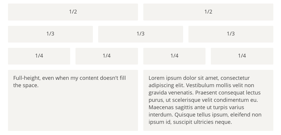

<!DOCTYPE html>
<html lang="en">
  <head>
    <meta charset="UTF-8">
    <title>Title</title>
    <style>
      .Grid {
        display: flex;
      }

      .Grid-cell {
        flex: 1;
        height: 30px;
        border: 1px solid red;
      }
    </style>
  </head>
  <body>
    <div class="Grid">
      <div class="Grid-cell">...</div>
      <div class="Grid-cell">...</div>
      <div class="Grid-cell">...</div>
    </div>
  </body>
</html>
百分比布局
某个网格的宽度为固定的百分比,其余网格平均分配剩余的空间
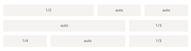
<!DOCTYPE html>
<html lang="en">
<head>
    <meta charset="UTF-8">
    <title>百分比布局</title>
    <style>
        .Grid {
            display: flex;
        }

        .Grid-cell {
            flex: 1;
            border:1px solid red;
        }

        .Grid-cell.u-full {
            flex: 0 0 100%;
        }

        .Grid-cell.u-1of2 {
            flex: 0 0 50%;
        }

        .Grid-cell.u-1of3 {
            flex: 0 0 33.3333%;
        }

        .Grid-cell.u-1of4 {
            flex: 0 0 25%;
        }
    </style>
</head>
<body>
<div class="Grid">
    <div class="Grid-cell u-1of4">...</div>
    <div class="Grid-cell">...</div>
    <div class="Grid-cell u-1of3">...</div>
</div>
</body>
</html>
圣杯布局
圣杯布局(Holy Grail Layout)指的是一种最常见的网站布局。页面从上到下,分成三个部分:头部(header),躯干(body),尾部(footer)。其中躯干又水平分成三栏,从左到右为:导航、主栏、副栏。
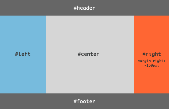
<!DOCTYPE html>
<html lang="en">
<head>
    <meta charset="UTF-8">
    <title>圣杯布局</title>
    <style>
        *{
            margin: 0;
        }
        .HolyGrail {
            display: flex;
            min-height: 100vh;
            flex-direction: column;
        }

        header,
        footer {
            border: 1px solid red;
            height: 100px!important;
        }

        .HolyGrail-body {
            display: flex;
            flex: 1;
        }

        .HolyGrail-content {
            flex: 1;
        }

        .HolyGrail-nav, .HolyGrail-ads {
            /* 两个边栏的宽度设为12em */
            flex: 0 0 12em;
            border: 1px solid blue;
        }

        /*如果是小屏幕,躯干的三栏自动变为垂直叠加*/
        @media (max-width: 768px) {
            .HolyGrail-body {
                flex-direction: column;
                flex: 1;
            }
            .HolyGrail-nav,
            .HolyGrail-ads,
            .HolyGrail-content {
                flex: auto;
            }
        }
    </style>
</head>
<body class="HolyGrail">
<header>#header</header>
<div class="HolyGrail-body">
    <nav class="HolyGrail-nav">nav</nav>
    <main class="HolyGrail-content">#content</main>
    <aside class="HolyGrail-ads">ads</aside>
</div>
<footer>#footer</footer>
</body>
</html>
输入框的布局
我们常常需要在输入框的前方添加提示,后方添加按钮
<!DOCTYPE html>
<html lang="en">
<head>
    <meta charset="UTF-8">
    <title>Title</title>
    <style>
        .InputAddOn {
            display: flex;
        }

        .InputAddOn-field {
            flex: 1;
        }
    </style>
</head>
<body>
<div class="InputAddOn">
    <span class="InputAddOn-item">...</span>
    <input class="InputAddOn-field">
    <button class="InputAddOn-item">...</button>
</div>
</body>
</html>
悬挂式布局
有时,主栏的左侧或右侧,需要添加一个图片栏。
<div class="Media">
  <img class="Media-figure" src="" alt="">
  <p class="Media-body">...</p>
</div>
.Media {
  display: flex;
  align-items: flex-start;
}

.Media-figure {
  margin-right: 1em;
}

.Media-body {
  flex: 1;
}
固定的底栏
有时,页面内容太少,无法占满一屏的高度,底栏就会抬高到页面的中间。这时可以采用Flex布局,让底栏总是出现在页面的底部。
<body class="Site">
  <header>...</header>
  <main class="Site-content">...</main>
  <footer>...</footer>
</body>
.Site {
  display: flex;
  min-height: 100vh;
  flex-direction: column;
}

.Site-content {
  flex: 1;
}
流式布局
每行的项目数固定,会自动分行。
.parent {
  width: 200px;
  height: 150px;
  background-color: black;
  display: flex;
  flex-flow: row wrap;
  align-content: flex-start;
}

.child {
  box-sizing: border-box;
  background-color: white;
  flex: 0 0 25%;
  height: 50px;
  border: 1px solid red;
}
总结
Flex 布局是 CSS 一维布局的核心方案,其设计哲学是 声明式空间分配——开发者只需描述期望的布局行为(扩展、收缩、对齐),浏览器自动完成计算。掌握 Flex 布局的关键在于理解以下核心模型:
- 容器-项目二层结构:容器属性控制排列和对齐,项目属性控制伸缩和覆盖
- 双轴模型:
justify-content作用于主轴,align-items作用于交叉轴,方向随flex-direction变化 - 伸缩三属性:
flex-grow(扩展)、flex-shrink(收缩)、flex-basis(初始尺寸),推荐使用flex简写 - FFC 格式化上下文:Flex 容器创建独立的布局环境,float 和 vertical-align 失效,外边距不折叠
- 自动边距:
margin: auto吸收剩余空间,优先级高于对齐属性
关于 Flex 布局的计算原理和深度机制,参见 2-flex计算原理;关于经典布局模式的实战案例,参见 3-Flex经典布局。
参考资料
- W3C CSS Flexible Box Layout Module Level 1 — Flexbox 规范原文
- MDN CSS Flexbox 指南 — Mozilla 官方文档
- CSS-Tricks: A Complete Guide to Flexbox — 最流行的 Flex 速查手册
- Flexbugs — 浏览器 Flex 实现的已知 Bug 列表
- Flexbox Froggy — 交互式 Flex 学习游戏